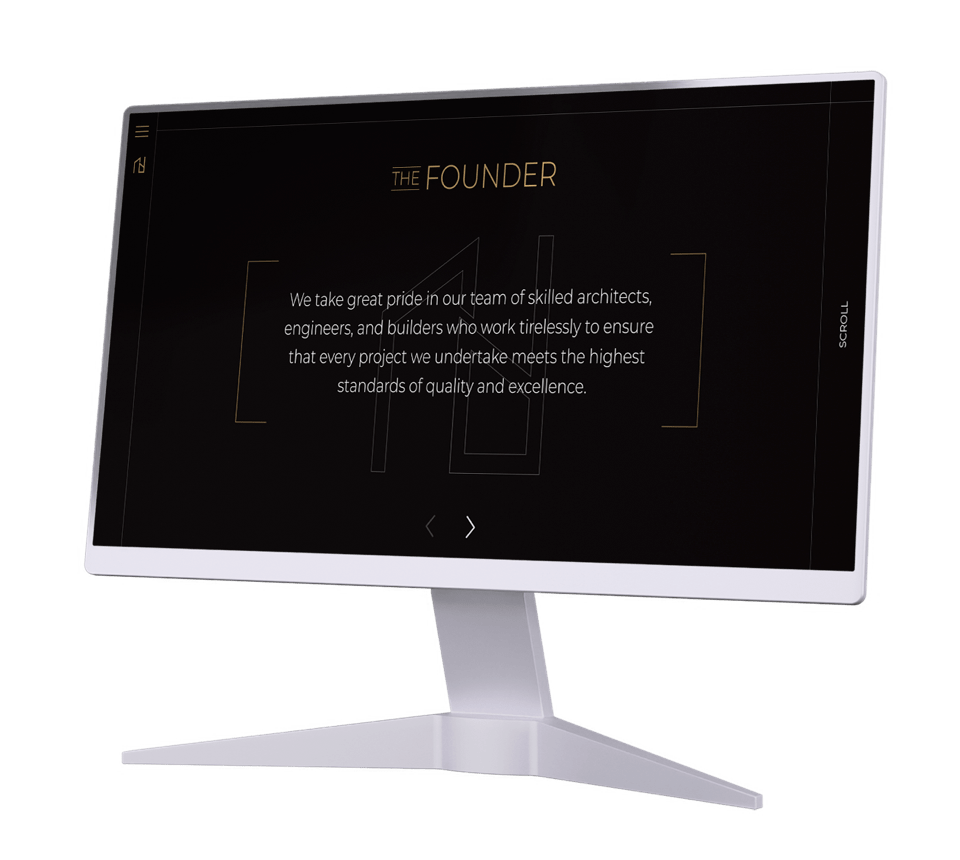


It’s a start-up company and it did not have enough stuff to showcase its work. It faced the challenge of establishing a strong online presence to attract potential clients. They wanted a visually appealing website that would convey their professionalism and expertise.

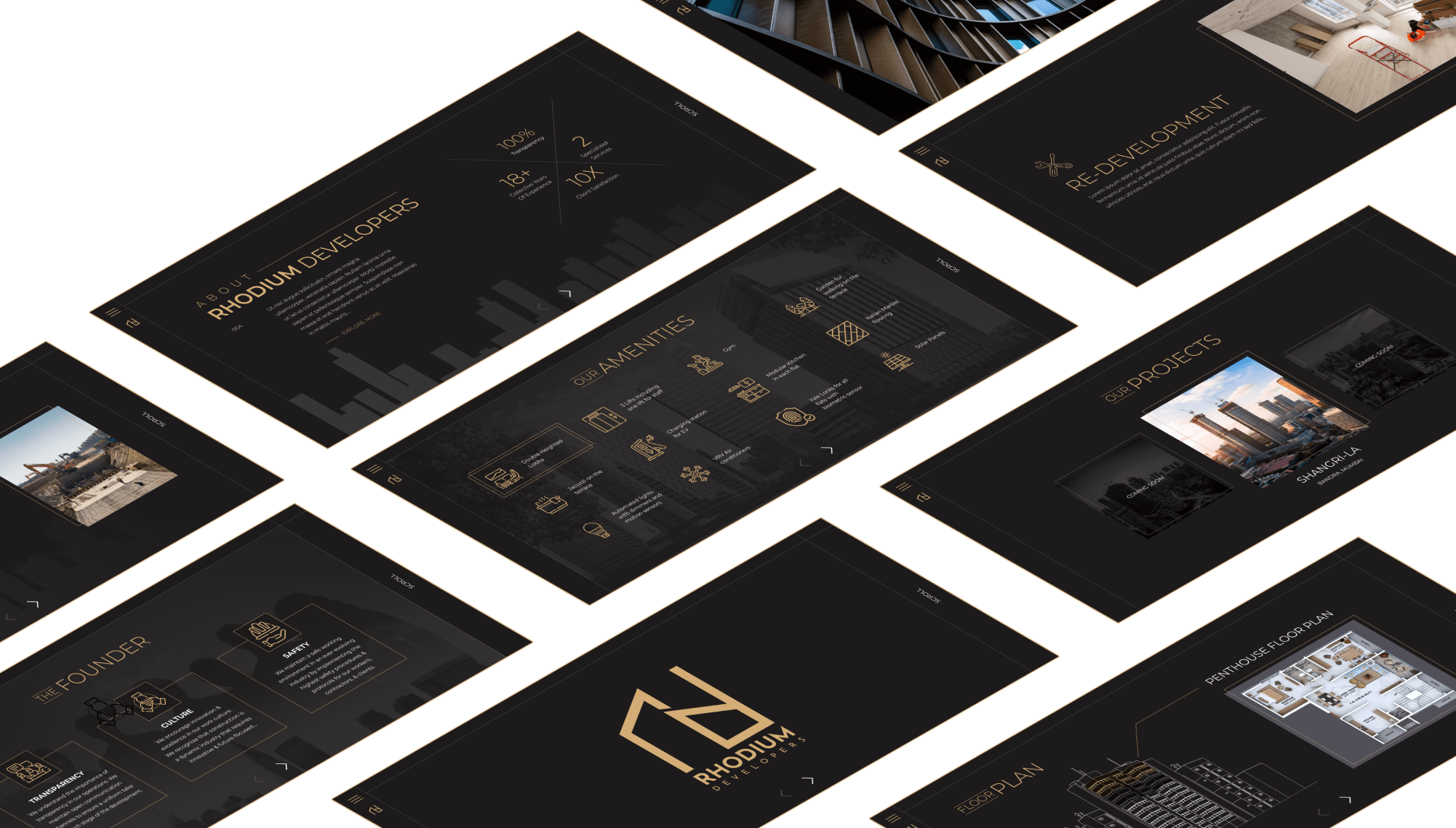
1A premium website template was designed in Figma. Blueprints of the home page and other internal pages were created. The color palette has been chosen wisely to exude elegance without compromising usability – sleek beige typography against crisp black backgrounds creates an impactful visual contrast that enhances readability and attention.

2By using strong visuals such as high-quality images and graphics showcasing their past projects, we aimed to convey their expertise and build trust with potential clients. The overall tone we maintained throughout the design process was professional yet approachable, reflecting the client’s brand image as a reliable and innovative construction company.

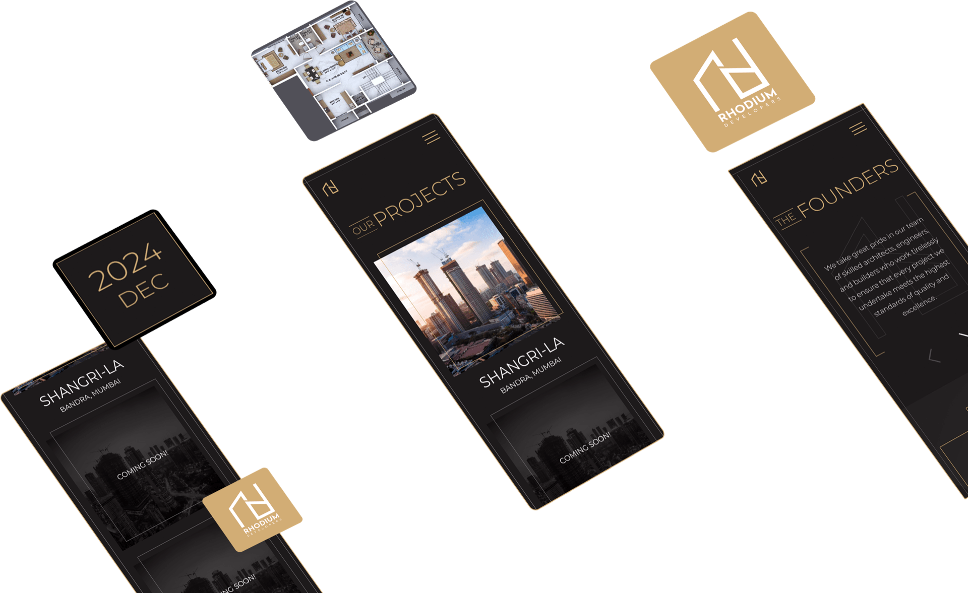
3 By incorporating intuitive navigation features and user-friendly interfaces, we ensured seamless browsing experiences for potential clients. By focusing on creating internal pages that offered valuable content and intuitive navigation, we were able to provide users with an immersive and informative experience. With intuitive menu options, easy-to-use contact forms, and visually appealing project showcases, visitors are certain to find exactly what they need with minimal effort.


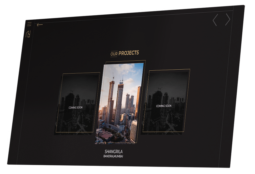
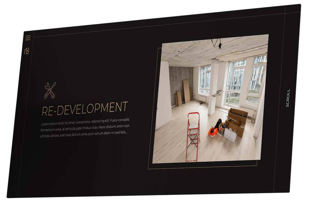
4 One of the primary goals for this project was to showcase the exceptional quality of their work through an impressive gallery section. By leveraging the power of visually appealing images and intuitive navigation, we successfully transformed their website into a virtual gallery that entices visitors to explore more.

5 A major challenge encountered during the project was effectively showcasing Rodium’s unique approach to building construction. By incorporating captivating visuals and interactive elements, such as 2D models and virtual tours, the website successfully demonstrates the intricate processes involved in constructing high-quality buildings. Additionally, clear and concise descriptions were implemented to explain each step of the construction journey, making it easily understandable for potential clients who may not be familiar with technical jargon.
During the testing phase, every aspect of the website will be put under a microscope to ensure its seamless functionality and performance. From checking cross-browser compatibility to ensuring smooth navigation on different devices and screen sizes, no stone will be left unturned. The comprehensive testing process aims not only to identify any potential glitches or bugs but also to guarantee that the user experience is intuitive and flawless.
By utilizing the latest techniques in search engine optimization algorithms, this website is now primed to attract organic traffic and boost its online presence.