Home » CSS » Everything About CSS Positions And Its Helper Properties
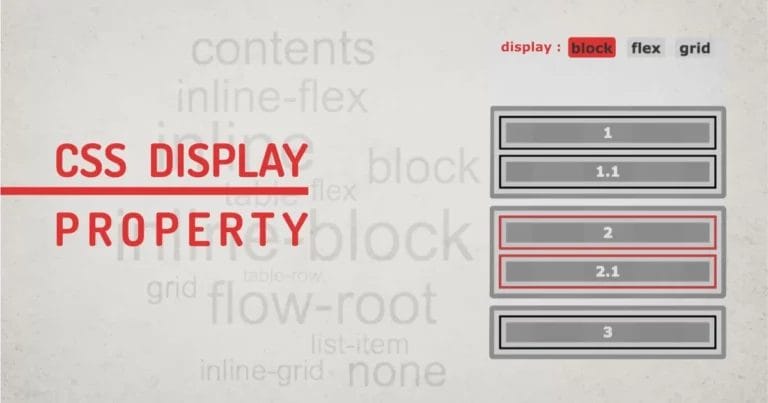
Have you ever wondered how display properties make an HTML element flow? Most of the layout models, like the box-model, the flex-model, and the float-model, use a Static Flow. meaning all the elements will take up space in the browser window as defined by its flow model. To make it understandable, all elements will flow on the page as they are defined in the browser style. Elements like div will use full-width space, elements like strong, em, span, and p will use inline flow.
Sometimes we have to put an element out of the flow, and sometimes move in the flow. We can do that using the CSS position property and some helper properties. We can set position values to static, relative, absolute, fixed or sticky to achieve this. All these property values behave differently in terms of flow. Let’s discuss using position properties like a pro in this article.
CSS syntax:
Selector{ position: <value>;}
Javascript syntax
document.getElementById('selector').style.position = "<value>";
<value>: can be either static, relative, absolute, sticky, or fixed
We can categorise these values into two groups. Values that put elements out of flow and values that do not put elements out of the flow. When you set one CSS position value and try to switch it between other values, you’d see other elements jumping around. That behaviour is because some values move elements out of the flow.
When an element is moved in or out of the flow, some helper properties are used to place the element at its desired position. Those helper properties are :
- top: valid positive width value
- left: valid positive width value
- right: valid positive width value
- bottom: valid positive width value
- z-index: valid integer value
Using Helper Properties:
When these properties are used with relative, absolute, or fixed, they move an element to the desired point on the screen from the top and left corners. This behaviour is also dependent on its closest related child, if not the body. I use a combination of two properties, like ( top and left ) or ( top and right ) or (bottom and left) or (bottom and right).
Why I avoid using opposite properties is that it can create confusion while using CSS absolute positioning. Results may differ on different screen sizes. The majority of the time, using the top will make the bottom ineffective, and using the left will make the property right ineffective.
If height and width are set, then the bottom and right properties will be ignored. Making the element snap to the top-left end. Try the following example to understand problems that might occur due to using opposite properties. Try checking any opposite properties and observe how the bounding box is not sitting inside the box.
When two or more elements are moved in or out of the flow, they might overlap with each other. The simple solution to arrange them in the correct depth is by using z-index. However z-index property has more complex usage when using multiple layers.
Now let’s look at the CSS position values and how they affect the flow of the layout.
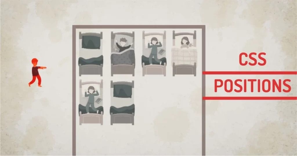
Throughout the article, we’ll use the same HTML structure as defined:
<div class="room">
<div class="bed"></div>
<div class="bed"></div>
<div class="bed"></div>
<div class="bed"></div>
<div class="kid bed-pos"></div>
<div class="bed"></div>
<div class="bed"></div>
</div>
</div>
We’ll change the CSS position property of the .kid class and observe the various behaviours.
Using CSS Position Property
CSS Position: static
This is the default value of position when we don’t specify anything. This position will take up the needed space and keep the layout in flow.
Our technical experts can help fix any issue you are having with your website, regardless of its complexity.
For example, try to GRAB THE SLEEPWALKING CHILD. Observe, helper properties change when you grab the element. Visually, there is no change. This is because helpers don’t work on static positions for all browsers.
CSS Position: relative
In addition to static positions, relative CSS positions make helper properties work. In other words, top, left, right, and bottom properties will start to affect the layout when a position is relative.
The element moves into a specified position because of helpers, which are the outflow behaviour. By moving this relative position element, we are not adjusting or removing its original space occupied. Means, there will be a blank spot at the object’s static position. This is in-flow behaviour. So relative acts as in-flow as well as out-flow.
In the example below, try to move the kid element with the mouse, Viola.
You can move the element from the original position, keeping the static space intact even after dragging the element. The static CSS position is shown as a dotted line in the demo
CSS Position: absolute
When a CSS position is set to absolute, it will take the element out of the flow, and the static space occupied by the positioned element will be collapsed. The positioned element will move relative to its closest parent, the document itself, otherwise.
In the below example, observe the bounding rectangle; the space of the walking child in the earlier example is occupied by the next element. This is the normal behaviour of the positioned elements.
This property allows the designer to manipulate elements because of its outflow behaviour. Helper properties will work the same as defined above.
position: fixed
Fixed-positioned CSS elements share the same properties as absolute in terms of flow and helper properties. Meaning, it will move elements out of the flow; the element can be moved using helper properties. But these elements will stay in their position even after page scrolling.
Fixed is a relative killer because its coordinates don’t react to any relatively positioned element. The element will place itself about the entire document.
Until…
It has an ancestor with a transform, perspective, or filter property set to anything other than none. If you have any container with the above properties enabled, the element will position itself inside the container, losing its ability to stay fixed on scroll.
Try the above example, The kid element is fixed. It has a parent container with position:relative. Grab the kid, observe the element coordinate that reacts to the document and not a relative parent.
position: sticky
In addition to the fixed-positioned element, think of sticky as a combination of both fixed and relative.
Only the top and left helper properties work with a sticky CSS position. When any helper property is set with sticky, the element will move up and down or side-by-side when you scroll. The element will stay fixed within its related parent.
In the example below, try to scroll the window both horizontally and vertically. Grab the child and move it around, and check the scrolling again. Observe, the element never goes out of its relatively positioned element. Even after specifying higher values than the container, it will stay inside the container.
There you have it. I have covered the most useful CSS positioning with examples.
Our technical experts can help fix any issue you are having with your website, regardless of its complexity.
Final Thoughts:
It’s no wonder most of the web uses statically positioned elements. Some enhancements are made over time by UI developers to various components of the site using positioned and fixed elements. We see positioned elements in various UI elements. To name a few multi-level navigations, sticky menus, overlaid elements, cards, lightboxes, chatboxes and many more. The position is too small a property, but once you know the fundamentals of each type, you’d be able to solve many complex problems and develop more complex layer-based designs.