Home » CSS » How To Use 3D Transforms In Perspective: 2D and 3D Transformations
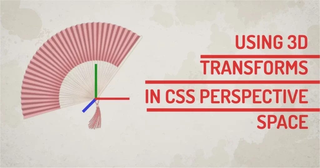
Using just a touch of 3D can make your UI stand out from the rest. But the problem with the current CSS system is that we have to do a lot of math, and object placement in 3D space is not too convenient. Mainly because CSS is not a great way to 3D, nor was it intended to be. The obvious problem here is how to use CSS 3D transforms using perspective.
To use 3D perspective transforms on any object, you can use the transform property and its values to manipulate, move objects in 3d space. How the individual objects will behave in a scene depends on the transformation of an object or parent and its transform origin. The key discovery of the article is to understand how transforms and transform-origin affect the object for its parent in 3D space.
3D Transform and Perspective:
To enable 2D or 3D transforms in CSS, we can use the transform property. Transform property visually moved the object in 3D space while keeping its placement in the DOM.
Syntax:
transform: <value> <value>;
Value: Value for the transform can single or multiple 2D or 3D functions. Let’s have a look at both types of values.
Values that affect CSS 3D Transforms:
We need a 3rd dimension to activate 3D. So we have to use any one of the below property values. We can combine multiple 3D properties separated by a space. We can use a combination of 2D and 3D properties to be used with perspective.
- translate3d(tx,ty,tz): move object along the X, Y & Z-axis.
- translateX(tx): move object along the X-axis.
- translateY(ty): move object along the Y-axis.
- translateZ(tz): move object along the Z-axis.
- rotate3d(x,y,z, a): rotates object by (a)angle around the [x,y,z] direction vector.
- rotateX(a): rotates the object around the X-axis.
- rotateY(a): rotates the object around the Y-axis.
- rotateZ(a): rotates the object around the Z-axis.
- scale3d(sx,sy,sz): scales tobject in [x,y,z] direction
- scaleX(sx): scales the object along the X-axis.
- scaleY(sy): scales the object along the Y-axis.
- scaleZ(sz): scales the object along the Z-axis.
- matrix3d(n,n,n,n,n,n, n,n,n,n,n,n,n,n,n,n): defines a 3D transformation in a 16 value matrix.
- Perspective (length): Defines how close or far the viewer is to a 3D transformed object.
Values that do not affect CSS 3D Transforms:
Transform properties can have 2D values as well. But these values/functions do not affect perspective in any way, being a 2D transform in nature. So let’s just pretend 2d transforms do not exist in our context. Values that can be used in conjunction with any 3d function are:
- rotate(a): rotates the object by (a)angle
- skew(a,a): skews object by (a)angle in x, by y directions
- translate(tx, ty): moves object by tx in x-direction, by ty in y-direction
- scale(sx,sy): scales object by sx in x-direction, by sy in y-direction
All the valid length values are supported as a parameter in these transform functions. So we’re free to use px, pt, cm, em, rem, vw, vh, and % values in any of the transform functions.
Our technical experts can help fix any issue you are having with your website, regardless of its complexity.
Transforming Element Using CSS 3D Transforms:
The basic transformation: translate, rotate, scale, skew, can be done in 2d and 3d space using their respective functions. Two factors affect the 3D view are perspective and transform-origin. The transform-origin property does not affect the 3D translate function, but all other functions are affected by the position of transform-origin. I have written an article explaining perspective-origin in my other article.
Please Note:
Transforms are not the same as using the CSS position property. Using position and any of the Top, Left, Right, and Bottom properties, we can move elements, but position moves the actual element in space. Not convenient for transitions or animations.
The CSS position property is a lot more straightforward – it simply allows you to set where an element should be placed on the page. However, this can be less flexible than using transforms, especially if you’re trying to create a design that looks good on different screen sizes.
Understanding Transform Origins:
The transform-origin is the point around which a transformation is applied. This single point is a pivot point, a center of gravity for all transformation for that object. This point only moves in 2d space. So even if the plane is rotated in 3d, the transform-origin always stays in x,y coordinates of the respective plane. Let’s check transform-origin in the context of the perspective transform.
Note: To enable 3D, we have to use the perspective function of the perspective property. Why?
The transform-origin will act as a 2d point for the parent container element. All the child elements will inherit the same origin when performing their transformation. We can use nested groups using this principle and create complex geometry.
CSS 3D Rotation in Perspective:
In the example below, we’re using simple keyframe animation to apply 3D rotations to the object. You can move the slider values to change the transform-origin and change the perspective value.
Observe: when a transform-origin is moved, the rotation of the element gets affected. How it is affected is visible in the example. The pivot point is the point from which the rotation starts.
If we turn off perspective, we can still see the Z rotation. But rotation in X and Y will give us an impression of element scaling in X and Y axes because there is no perspective.
CSS 3D Scale in Perspective:
In the example below, we’re scaling the 3d object in the x and y directions. Since the transform-origin is on the top plane of the object. It will act as a pivot for scaling the element and its parents.
You can observe the behavior of a scale by moving the transform-origin using sliders. You can change the perspective value to change the depth of the element. The element itself is a 3d object. But the transform-origin does not work as a pivot for ScaleZ. The child elements will get a 3d scale in the Z direction, but changing transform-origin on the parent won’t affect scaling at all. This is the behavior of transform-origin. It only acts as a pivot for the 2d plane.
Our technical experts can help fix any issue you are having with your website, regardless of its complexity.
If we turn off the perspective, we can see the scale in the X and Y axis, but without depth, scaling in the Z direction does not seem to work.
CSS 3D Translation in Perspective:
The translation is comparatively easy to understand because transform-origin does not affect any of the translate functions. You can observe the example below.
If you move any of the sliders, it changes the perspective values and transform-origins, but the transformations on the object are not affected by those changes. Because translations do not require any transform-origins.
If we turn off perspective, we can still see translation in the x and y-directions. Z-direction will not work because there is no depth.
CSS Skew (Non-3D) in Perspective:
Skew does not have a 3D function, but transform-origin behaves the same as scale on skew function. We’ll use the same book demo and use skewX and skewY functions to skew the parent object.
Since it’s just a 2d function, it behaves like any other 2D function (translate, rotate, scale). Skew can use transform-origin and manipulate the parent element in 2D space. The child element will inherit from the parent.
Why this is so important to know is: To understand that we can use a 2D transform function on the parent with 3D child elements. Or combine 2D and 3D functions to get the desired result. There are many tricks you can do by mastering 3D transforms. You can read about Top CSS Tricks in my other article.
How can I use CSS 3D Transforms in UI elements?
Most UI frameworks use CSS transforms to do part of the UI, like Tooltips, Input Validations, Dialog boxes, Navigation Items, Gallery Images, etc. If you master the art of perspective, with too little work, you can get your UI a more modern feel. However, this is subjective, so let me know if you’re going to try Perspective transforms in your UI design.