Home » CSS » CSS Animations Master Class: Everything About Animations Without Javascript
If you want to add something more to your CSS transitions, you can use predefined keyframe animations to change the CSS properties of your DOM element.
CSS animations are a way to switch transitions from one CSS style configuration to another using multiple steps. This can be achieved using a 1. Rule – which describes a set of keyframes to define the start and end state of the property and possible intermediate waypoints. 2. Animation Property – to apply the animation to the element.
Possibility:
Right off the bat, I’ll say CSS animations are good for smaller tasks because they use CPU memory, and using layers of animation could slow down CPU performance. But for developers who like to put all animation logic on the CSS level, this is a way to go. Put all of your decorative animations in one file and use them with JS to trigger animations – easy as a piece of cake. But there are many things CSS animations can do and can’t do.
But first, let’s understand how CSS animation works.
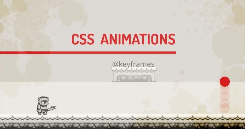
Let’s understand CSS animations using an example:
Animation below is made with simple infinite animations with different layers animated using keyframe definition. We have a couple of keyframe definitions for each individual element.
Any animations in CSS have two parts. 1. keyframes and 2. animation.
1. Keyframes:
A Standard keyframe definition will define at least a starting keyframe and at least one end keyframe.
Each keyframe describes how the animated element should render at a given time during the animation sequence. Keyframes range from 0-100% also identified by from-to. These keyframes give a browser indication of when to start and end the animation.
@keyframes animation-name {keyframes-selector {property:value;}}
- animation-name – Defines the name of the animation.
- Keyframes-selector – can be between from / 0% and to / 100%. Can be any intermediate value in percentage.
- CSS-styles – One or more animatable CSS Properties
Not all the CSS properties are animatable. But we can use the properties below while creating a keyframe definition.
Animatable properties:
Physically Affected Properties:
- Width
- Height
- Margin
- Padding
- Transform
- Left
- Right
- Top
- Bottom
- Perspective
- Text-indent
- letter-spacing
- Line-height
- word-spacing
- font
Decorative Properties:
- Background
- Border
- Box-shadow
- Clip
- Color
- Filter
- Object-position
- Opacity
- Order
- Outline
Our technical experts can help fix any issue you are having with your website, regardless of its complexity.
We need to define at least two states of an object. In the given example, the simplest keyframe is used as below:
@keyframes movebg {
from {
background-position: -0px 100%;
}
to {
background-position: -96px 100%;
}
}
We’re moving the background-position property, in this case, to move the background in the x-direction. This creates a platform in the scene.
The alternate version of the same keyframe definition with added waypoint at 50% looks like this:
@keyframes movebg {
0% {
background-position: -0px 100%;
}
50% {
background-position: -48px 100%;
}
100% {
background-position: -96px 100%;
}
}
Almost all the definitions in the example are defined using one of the above methods.
2. Animation:
The animation is triggered using the animation property of the object. The syntax for using animation is as below.
{ animation: name duration timing-function delay iteration-count direction fill-mode }
All of these properties can be used individually if you don’t want to use shorthand properties. To start the animation, at least animation-name and animation-duration are required. I have also explained how to trigger animation on scroll, which explains a simple JavaScript method to animate objects on-demand or on interaction.
Configuration of animation properties:
1. animation-name:
Specifies the name of the @keyframes at-rule describing the animation’s keyframes. Multiple animations can be used by using a comma separator
2. animation-duration :
Configures the length of time that animation should take to complete one cycle. It can take seconds or milliseconds as a unit.
To illustrate this, we’re using the dropping ball example to see how duration affects the animation playtime. The example shows how the animation behaves for different durations.
3. animation-timing-function:
The timing function defines how the animation will transition through keyframes, by establishing easing curves. The default value is ease.
Let’s see the same ball dropping animation with different timing functions. Some styles of easing will look better than others depending on the type of animation we’re looking for.
For example, dropping a ball does not look good if it uses linear easing because that’s not how physics on the ball works. We can use Chrome Dev Tools to create cubic bezier curves to create custom timing functions. We may need to use linear mode for showing something continuous in motion like a wheel or a clock. The demo uses linear, ease, ease-in, ease-out, ease-in-out, and steps functions. These functions can be manipulated using a cubic Bezier curve.
Note: The TREEMAN character in the first demo uses the steps timing function to loop through the image sequence inside a sprite. The walking animation is a sprite trick that game developers use to animate the game character.
4. animation-delay:
Defines delay before the beginning of the animation sequence.
It creates a delay for every iteration of the animation. It accepts seconds – 1s or milliseconds – 500ms as a value. Default value:0s. To understand this, we’re using the same ball function with incrementing delays.
This creates a beautiful stagger effect. There are so many things that you can do with this simple little property. Sequential animations look good if done correctly.
5. animation-iteration-count:
How many times should the animation repeat? The values can be infinite or any number. The animation will stop after the defined number of iterations. Default Iterations: 1. Same dropping ball animation, for example.
Our technical experts can help fix any issue you are having with your website, regardless of its complexity.
Hover anywhere on the screen to see the animation. This is quite simple to understand, so no more words are needed to describe it further. Hover on the window to see states in action.
6. animation-direction:
Defines the behavior of the animation. What should happen after all the animation frames are completed once.
- Normal: the animation plays from 0% to 100%.
- Reverse: the animation plays from 100% to 0%.
- Alternate: the animation plays from 0% to 100% in the first iteration, from 100% to 0% in the second iteration, and from 0% to 100% again, for a defined number of animating-iteration-count runs.
- Alternate-reverse: the animation plays from 100% to 0% first iteration, from 0% to 100% in the second iteration, and from 100% to 0% again, for a defined number of animating-iteration-count runs.
The example below demonstrates the usage of direction. Hover on the window to see it in action.
7. animation-fill-mode:
Defines which values are applied by the animation before it starts, after it ends, or both. Accepted values: none, forwards, backwards, and both.
This does not work for infinite animations. Hover on the window to see states in action.
- forwards: tells CSS to style the animated element such that it contains styles from the last @keyframes it encountered. If the animation goes in the normal direction, CSS will style the element with properties from the 100% step. If the animation goes in the reverse direction, CSS styles the element with properties from the 0% step.
- backwards: tells CSS to style the animated element according to where it originated. In practice, this looks exactly the same as none. I don’t see a good use case for it.
- Both: tells CSS to apply properties in both the forward and backwards direction. In practice, this works exactly like forwarding most of the time. I don’t see a good use case for it either.
Of the four different fill-modes, the one you’ll most likely use is forwards. Hover on the window to see states in action.
8. animation-play-state
Can pause and resume the animation at a given time. This property is useful while using JavaScript. Accepted values are running or paused.
Simple animation to show this functionality. Hover on the window to see states in action.
When to use CSS Animations
The short answer since CSS animations eat memory, avoid excessive use of them. I use it for:
- For small micro-interaction style animation, Transitions cannot provide.
- For multi-step transitions, that can’t be achieved by transitions.
- For Simple animations. The current state of animations can’t do lots of maths.
- For Animated Hero elements.
But I’m an expert. I want to create interactive apps. What should I do?
Use JavaScript solutions like GSAP. With JS, it performs extremely well. You don’t need to worry too much about object position and rotations because all the math is handled by JS, and we can just get creative.
My demo looks like a platform game. Can we use CSS to build games?
Not. Use canvas-based JS libraries for that. They are meant specifically for that task.
CSS Animation Performance:
There are three key advantages to CSS animations over traditional script-driven animation techniques:
- They’re easy to use for simple animations.
- They can be used without even having to know JavaScript.
- The animations run well, even under moderate system load.
- The browser can use frame-skipping and other techniques to keep the performance as smooth as possible.
Final Words:
If you know what you’re doing, then you can do many creative things just by using CSS. For starters, I’d suggest using JS-based transitions. Animations are just transitions on steroids, It can do things transitions can’t do, but at the cost of memory. If you master the art of optimizing all the transitions and animations, you can create better-looking and performing apps. I have an article that can help to decide when to choose either animation or transition for your project.