Home » CSS » Using z-index To Create Stacking Content With Interactive Demo
The z-index represents the depth of the DOM element in the browser. The higher the value, the closer the element to the user. This means elements with lower z-index will be pushed down in the stacking contexts. Is that it? There is more to z-index than just stacking elements. If used correctly, it can solve many layout problems.
To use CSS z-index, we need to specify a z-order number for the specific element. This will change the depth or z-order of a positioned element and its descendants. If not specified, the default value for the z-index is set to auto. Which will follow the natural order of stacking as per the order in which they are defined in HTML. This means the elements at the bottom of the HTML will get a higher z-index than the ones at the top of the code.
Syntax for z-index:
Selector{ z-index: <value>; }
<value>: It accepts any integer value within 32bit range that is : 0 – 2,147,483,647.
The z-index property can have the following values:
- auto – default value.
- number – An integer value.
- initial – initial value.
- inherit – inherits value from immediate parent.
JavaScript Usage
document.getElementById('selector').style.zIndex = <value>;
Why use z-index?
Creating overlapping layers on the web across various browsers can be challenging sometimes. Especially if you’re not the maker of the source. The example below shows how layers overlap when z-index is defined.
You see, z-index makes it easy to overlap elements just by defining a z-index number for that element. When z-index is applied to an element, it creates the stacking context. To understand the stacking context, let’s first understand how natural stacking works and its problems.
The Natural Stacking Order:
As I mentioned earlier, elements with no z-index defined will get an auto z-index and 0 value. But positioned elements with z-index will always get a higher z-index than non-positioned elements. Non-positioned elements will have z-index stacked from bottom to top – this is the natural stacking order of the DOM elements.
How the default source order works when no z-index is defined:
The children of a stacking context are stacked from bottom to top within the parent. Some rules can create a stacking context, which will move elements on top of the auto-valued elements and change the depth of the element. Each of these rules has precedence over other rules, meaning rule #1 has less precedence and rule #6 has the highest precedence, so elements with rule #6 will be on top of other elements.
- Background and borders of the element that establish stacking context
- Elements with negative stacking contexts are ordered as defined in HTML
- Non-positioned, non-floated, block-level elements, ordered as defined in HTML
- Non-positioned, floated elements, ordered as defined in HTML
- Inline elements are ordered as defined in HTML
- Positioned elements, ordered as defined in HTML
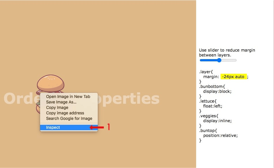
Check the demo with natural stacking order. Normally, this is what you’ll do while adding elements one by one. Drag the slider to decrease the margin to overlap the elements.
You only have to check values for one class in this demo, which is:
.layer{ margin:0 auto;}
In this demo, the elements are defined as follows:
- Top Bun
- Veggies
- Cheese
- Beef
- Lattice
- Bottom Bun
A slider will change this layer position to -40px top and bottom so you’ll see how elements naturally stacks and overlap with other elements.
The first burger is not what you expect with the demo. But this is natural. Layers are always stacked as they are defined in the source.
To fix the demo naturally,
We have to reverse the order of layers in the source. Imagine making a burger, we have to put the bottom bun first, then everything else goes on top of that layer. Similarly, if we reverse the order in the source, it creates burger layers in the correct depth, but they are visually reversed. In this demo, we have used negative margins to fix the stack, but negative margins don’t always play well in all conditions.
Sometimes, we can hack depth with the help of the rules discussed above. Some properties will create a stacking order for an element and move the element above the auto-valued elements.
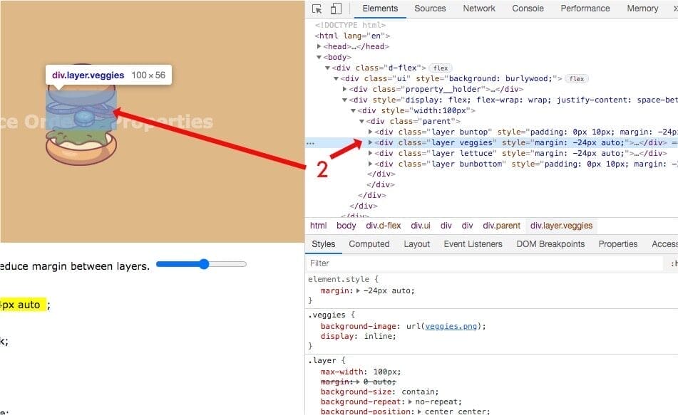
We’ll use the same burger example with fewer layers, so this is clearer. In the demo below,
We are using the default source order with the properties that create stacking context. From the above rules, #1 and #2 are obvious. We need the background to see layers overlaying, and layers with position and negative z-index will always be moved below auto layers. In this example, I have demonstrated how stacking order is created when we apply block, float, and inline properties.
HTML Structure:
<div class="layer buntop" style="padding:0 10px;"><img src="bun.png" /></div>
<div class="layer veggies"><img src="veggies.png" /></div>
<div class="layer lettuce" ><img src="lettuce.png" /></div>
<div class="layer bunbottom" style="padding:0 10px;"><img src="bun_bottom.png" /></div
CSS Style:
.buntop{ position: relative;}
.veggies{ display: inline;}
.lettuce{ float: left; }
.bunbottom{display:block;}
In this example, I have used the 4 rules discussed above to demonstrate that the stacking – float, display, and position properties create a stacking context. The position is with the highest order.
There is no change in source order. The code looks like how it appears visually. I’ll call this method a hack. A more defined way to use stacking context is always using z-index.
Stacking context when z-index is defined:
We now know how the default source order works without a z-index. But when the z-index is defined, the rendering order of the element and its child is affected by that z-index value. This happens because the z-index enables special properties which cause them to form a stacking context.
The order of the stacking context is affected by some other CSS properties defined along with the z-index value. The element that has either of the following properties is defined, and the element will get an order accordingly:
- Root element of the document (<html>).
- position value absolute or relative.
- position value fixed or sticky.
- child of a flex container.
- child of a grid container.
- opacity value less than 1.
- mix-blend-mode value other than usual.
- properties with value: transform, filter, perspective, clip-path, mask / mask-image / mask-border
- isolation value isolate.
- -webkit-overflow-scrolling value touch.
- will-change value specifying any property that would create a stacking context on a non-initial value.
- contain the value of layout, or paint, or a composite value that includes either of them (i.e., contain: strict, contain: content).
Our technical experts can help fix any issue you are having with your website, regardless of its complexity.
Creating stacking contexts with other properties:
When we apply any of the properties defined below, it will create a stacking context, ordered by how they are defined in the source.
- Opacity: A Value less than 1, like 0.9999, will create a stacking context, pushing other elements down.
- Transform: Any kind of transform will create a stacking context. This means just assigning default values will create a staking context for that element.
- Clippath: When we add any shape of clippath to an element, it will push another element down.
- Mix-blend-mode: Any mix-blend-mode other than the default values will create a stacking context.
- Filter: A new stacking context is created by applying any valid filter.
- Perspective: By enabling any perspective value will create a stacking context.
- Mask: Any kind of mask will get that element on top of other elements.
You see the problem here, when we use any of these methods to overlay objects on top of one another, we have pretty limited ability. We can go only a few steps above in depth. Other elements will still follow the source order. So we can have limited layers of overlay without using z-index.
- Elements with natural source order. 1st Layer or It doesn’t create any stacking context.
- Elements that are floated, inline, and positioned without z-index. This method can have 4 layers at max.
- Elements that have either of the properties defined, as discussed above. It can have 1 layer.
This method is not useful when we have layers of elements to be stacked. It’s good for getting over a few elements. Having different properties to stack elements or overlay them is too confusing.
Debugging stacking context issues
If you are reading this for the first time, I assume you have thought that z-index means order in the z-axis from the viewer. The greater the index closer to the viewer. But it’s a bit more complex than that. Sometimes, we run into a condition where you feel like the z-index is not working or has no effect, no matter how big the number you enter for the element. The element can’t overlap with another element.
What to do in this situation?
Step 1: You can debug the stacking issues with Firefox or Chrome Dev Tools. All the browsers have this element inspection tool. You need to inspect that element first.
Step 2: Once you inspect the element, you need to search for an element in the code. You’ll see a highlight in your browser window as you hover over the code. You need to select the element to debug.
Step 3: The next step is to inspect the CSS properties and their values. If you know about the stacking context and z-index, you can debug the element by turning off the z-index, increasing or decreasing the value depending on what you are trying to do.
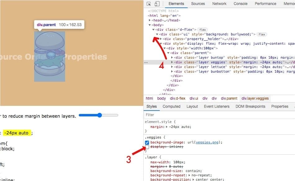
Step 4: You have to do this for the element itself, moving towards the parent and up in the hierarchy, doing the same process until the solution is found.
So if you know what to look for, it is just a matter of seconds to debug z-index related problems.
Why does z-index not work?
Some reasons why the z-index might not be working are:
- Element’s parent has the lower z-index. In this case, no matter how great the z-index of the child might be, it would never get over the element whose z-index is greater than the z-index of the element’s parent.
- The element doesn’t have a position defined. This could be the case when the element itself or its parent does not have the position property defined. If parents don’t have position property, elements with a higher z-index can overlay all the elements within their nearest relative element, the root element otherwise.
- There could be a position property problem. Elements with position elements defined will be stacked with precedence. So, the position value of static or sticky can’t overlay the element with position relative or absolute until the z-index is defined with the proper values. This means the position is fixed and static, and has a higher z-index to overlap elements with the same z-index as position absolute or relative.
Our technical experts can help fix any issue you are having with your website, regardless of its complexity.
Final Words
Although z-index is not such a complex property, sometimes it’s hard to debug overlapping elements in CSS. Having knowledge of the stacking context and how it creates stacking helps to understand the problem better. Beginner developers could use these fundamentals to solve the beginner’s problems. Pro developers know how to use stacking context and z-index precisely in a scalable application.