Home » CSS » CSS Variables – Definition, Usage And Performance Explained
Before the year 2016, designers had a big problem redefining repetitive properties over and over. While working on the theme, one has to define some global colors many times in the CSS. Making changes was never too easy with the search and replace function of the IDE. At the time, preprocessors like SASS and LESS helped a lot with CSS generation. The real question here is…
Does CSS have variables?
Programmers often solve the problem of repetitive property assignments by using variables or global variables in CSS. SASS and LESS had the advantage of having the ability to declare variables and use them for further CSS customization without modifying too much code. Guess what? CSS does introduce variables and we can use CSS variables to solve many problems.
Variables are natively supported in all browsers. Well “some browsers” -you guessed it right… still don’t have support for CSS variables.
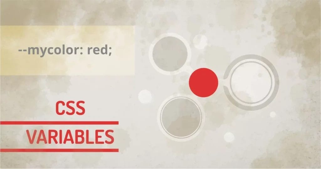
How to use CSS variables:
CSS variables have to be declared inside the CSS rule. The selector can be any of the valid selectors. If it’s a global variable, we can use (:root) selector so the variable will be available for all the other selectors for use. See how this solves the problem of encapsulation by providing the functionality of component-based variables.
We’ll use this simple example to understand most concepts of CSS variables.
Observe the colors and the gradient in the background in the infographic. Change the colors to see variables in action. This is the simplest version of CSS variable it could be. Now let’s begin.
Where to declare CSS variables:
We can define CSS variables in :root selector globally or inside any CSS selector for local use.
/* Declares variable globally */
:root{
--variable : <value>;
}
/* Declares variable inside local component */
.componenet{
--variable: <value>;
}
- –variable: can by any name followed by — forexample: –color, –width, –padding, etc.
- <value>: can be any string that defines a value for the property
We can define CSS variables using two hyphens ( -- ) and specifying any valid value that its target property can take.
Our technical experts can help fix any issue you are having with your website, regardless of its complexity.
Using CSS variables:
.component .block{
<property>: var(--varible);
}
- <property>: can be any valid property that accepts a value defined by the variable
In the above example, the width property will get the value defined by the variable in .component because it has the highest specificity. If that’s not defined locally, the property will use the variable defined by :root. It follows the default cascading behavior of CSS.
What if…
The variable is not defined at all?
Fallback Value for Property
All the properties have some inherited values. If not defined, the property will use the inherited values. We can, however, specify the default value when using the variable. The alternate version of the var function is as shown below.
.component .block{
width: var(--varible,200px);
}
Invalid Values:
Programming languages have different variable types for different purposes. But CSS uses text for variables. So receiving property will not know if the defined variable gives a valid value or not. This is the limitation of CSS variables. CSS at this point is not showing any error if the specified value is invalid.
How does CSS handle an invalid value?
If any property receives an invalid value from var() function, it will check the following and substitute the value.
- Checks if the property is inheritable from its parent. If not, then follow step 2.
- Set the property value to initial.
Inline Style and CSS Variables:
The inline styles have the highest priority over any other styles. Also, inline styles are limited to the applied elements only. Similarly, we can define/re-define the CSS variable by defining it in an inline style tag. So what makes it different than using normal CSS property value and CSS variables?
Well for component-based CSS coding allows us to override CSS variables using inline style. This means we can change/override any number of variables just using the single style tag. The sub-components will be styled automatically as per their definition.
In the example below, we defined variables as follows in the component:
.component{
--color1:#e91e63;
--color2:#97cc19;
--color3:#ff9800;
}
Our component has elements that use background values as variables. Changing the value of any variable will update the backgrounds for the element and the gradient.
.layer2 .color1{
background: var(--color1);
}
.layer2 .color2{
background: var(--color2);
}
.layer2 .color3{
background: var(--color3);
}
.layer1 span{
background: linear-gradient(0, var(--color1),var(--color2),var(--color3)) ;
}
Observe the change in inline CSS. See how a change in a variable of a component changes the colors of its child element. In this example, the colors of the circles and the gradient below.
Compare this with the bootstrap class method. We can style a button using classes like .btn-primary , .btn-secondary etc., but that would be limited to predefined bootstrap colors only. But if we use CSS variables, we can easily apply any color to the button or set of buttons inside the component.
How to use CSS variables in JavaScript
On any selected property, we can set the variable using the following syntax:
var element = document.getElemntById('element');
/* gets the --variable value from inline style. */
element.style.getPropertyValue("--variable");
/* gets the --variable value from global variable */
getComputedStyle(element).getPropertyValue("--variable");
We can get set the variable using setProperty method.
element.style.setProperty("--variable", "100px");
How to name CSS variables:
The most commonly used method is the BPM (Block-Property-Modifier) method. It’s a bit of overhead to variable naming, but you don’t have to remember what a variable is doing when using this naming convention. The variable name itself will contain the component name, the property, and the value of the variable. You can use any of the combinations of Block, Property Name, or Modifier as needed.
::root{
/* only property as variable name */
--color: blue;
/* property and value as variable name */
--color-pink: pink;
}
.component{
/* block, property and value as variable name */
--card-borderradius-pill:20px;
}
Using CSS variables with calc()
If we want to concede something real-time for some reason in CSS, you have to use the calc() function correctly. The calc() function gives the ability to perform addition, subtraction, multiplication, and division, We can’t add any string with the var() function itself.
::root{
--width:100;
}
.component{
width: calc(var(--width) * 1px); /* works with unit less width */
width: calc(var(--width) / 1px); /* works with width with valid width */
width: calc(var(--width) - 1px); /* works with width with valid width */
width: calc(var(--width) + 1px); /* works with width with valid width */
}
Preprocessor vs CSS variables:
I think the preprocessor existed because of the incapability or static nature of CSS. But no more. If we can define CSS variables and have them scooped as needed, chances are… we might not need preprocessors. Why not use native functionality and manipulate it with JavaScript?
The common thing between preprocessor and CSS now is that they both can have variables. Preprocessors are still static as preprocessor variables are compiled down to static values. CSS variables are the actual variables that the browser can parse at runtime. This leads to the next question…
Are CSS Variables Slow?
The answer to why something is slow is that they have something to compute before the actual rendering process. CSS is static for the most part. But if we use something that recalculates the layout too many times, it will slow down the performance. Thinking of the parsing process in CSS, we have a calc function that recalculates widths. The worst is defining a unitless number and using it in a parent container with the calc() function. Imagine a container with 1000 elements that will cause too much calculation, causing janky performance.
So one should keep in mind that CSS variables are a perfect way to keep our code DRY. But we should avoid using unitless numbers with calc() function. It could trigger a slow performance in some cases.
This boils down to the following practices:
- Don’t change global variables too much, it will trigger recalculation on all the child items.
- Don’t use unitless numbers and add them with the calc() function on the fly.
Our technical experts can help fix any issue you are having with your website, regardless of its complexity.
Workaround for CSS variables in IE?
CSS variables were introduced in 2012, and by the end of 2016, they were widely supported. It’s been a long time but I think IE doesn’t seem to have any plan of using it, so for the time being, we have to just use fallback CSS.
selector{
color:blue;
color: var(--color);
}
I know you hate it, right?
Will you use CSS variables in your next project?
You know now why to use CSS variables and what problems they solve. CSS variables will give you extra control over using legacy methods. You can use your coding style more efficiently. Since it’s a pure CSS feature and it’s mostly supported, You’d better start using it. You’ll see how easy it is to maintain and modify.