Home » CSS » CSS Secrets Every Beginner Should Know To Level Up Their Web Development
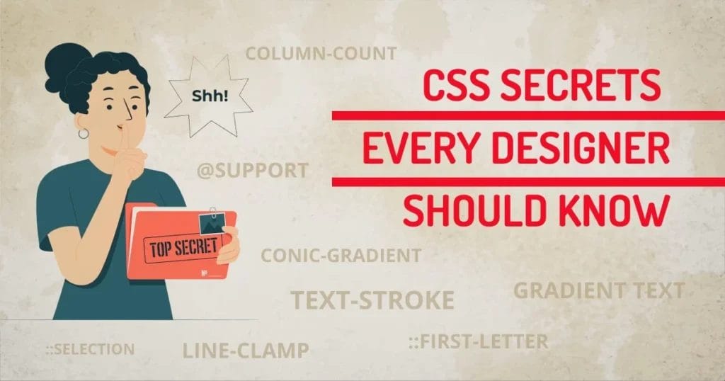
To be extra creative, a Designer needs to explore the unknown secrets of the web used by professionals. For CSS, certain secrets can help you make the most of this powerful style sheet that could make a difference in your UI. For example, did you know, you can use CSS to create animations? Or that there are ways to optimize your CSS code so that it loads faster? Here are some essential CSS secrets that every web developer needs to know:
Among many secrets, here I have listed a group of 3 secrets for beginners.
1. CSS Secret To Control Content
The following properties make it possible for us to regulate text and image behavior based on whatever size or proportion the container is.
1. Line-clamp
This CSS property allows us to create an ellipsis effect, truncating text at a specific number of lines. While this may seem like a simple thing to achieve, there are some caveats that you need to be aware of. It can be used on any element, including text blocks, lists, and table cells. It’s supported by all major browsers, with partial support for IE11. Line-clamp is perfect for creating truncated text that still feels natural to read.
So if you’re looking for a way to limit the amount of text on your web page without resorting to JavaScript or hiding content offscreen, line-clamp is worth considering.
2. Column-count
One secret that every web developer should know is how to use the column-count property. This property allows you to specify the number of columns an element should be divided into. For example, if you wanted to split a paragraph into three columns, you would use the following CSS:
p {column-count: 3;}
Another CSS secret that can be extremely useful is the overflow property. This property allows you to control what happens when content overflows an element’s box.

3. Character unit
One secret is to understand character units. Character units are used to specify the size of text on a web page. There are six different character units: px, em, rem, vh, vw, and cm. Each unit has its advantages and disadvantages.
Px is the most commonly used character unit. It is easy to understand and use.
However, px can be difficult to scale. Em is another common character unit. Em is relative to the font size of the parent element. This can be advantageous because it allows you to easily scale text up or down.
Again, em can be difficult to control in nested elements. Rem is a newer character unit that is becoming more popular among developers.
Rem stands for “root em”. This unit responds to the font size of the root element. Here is a simple example of ch, which stands for character. This limits the width of the content according to their character count. This is useful because no matter what font you use, the display will stay the same.

4. Word break tag <wbr>
One secret is the word break tag (wbr). This can be used to insert line breaks in long words or strings of text. This can help make your text more readable or prevent overflow issues. To use the word break tag, you need to add the code <wbr> between the words you want to keep apart. For example, if you have a sentence that is too long to fit on one line, you can use the word break tag to keep it from running together.
This can be a great way to improve the look of your site and make it easier for visitors to read.

5. Object fit
This CSS property allows you to control how an element with a specified width and height fits into its container. For example, you can use object-fit to make an image fill the entire container, or you can use it to make the image fit snugly within the container. You can set the object-fit property to one of four values: fill, contain, cover, or none. Each value has different effects on how the element is sized and positioned within the container.
Fill in the default value, and it will cause the element to fill its container, even if it has to be stretched or distorted to do so. Contain will size the element so that it fits entirely within the container, but doesn’t have to fill it. This may result in space around the element inside the container.
Our technical experts can help fix any issue you are having with your website, regardless of its complexity.
2. CSS Secret To Control Typography
The typographical direction of your CSS can have a big impact on the overall look and feel of your web page.
1. ::first-letter
One secret is the first-letter selector. This selector allows you to target the first letter of a block of text and style it however you want. For example, you could make the first letter larger than the rest or add a different color. The first-letter selector can be used to add special styling to the first letter of a paragraph. For example, you could use it to make the first letter larger than the rest of the text.
The:first-child and:last-child selectors can be used to select the first or last element in a container.
2. Text-stroke
Text-stroke is a relatively new CSS property that allows you to add a stroke or outline to your text. This can be extremely useful for making the text more legible, especially on small screens. It’s also great for creating unique and eye-catching designs.
Text-stroke is a great way to add an extra bit of flair to your text. By adding a stroke around your text, you can make it stand out more and add some extra dimension. To create a text-stroke effect, all you need is the CSS property “text-stroke” and a few values. The first value is the width of the stroke, the second value is the color, and the third value is the line height.
You can also use text-stroke to create interesting effects like word clouds or neon lights. Just experiment with different values until you find something you like!
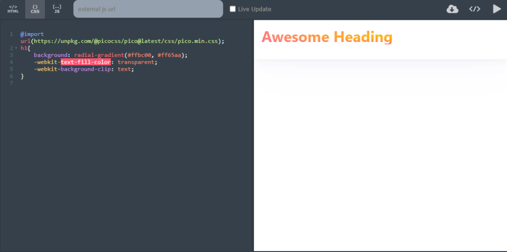
3. -webkit-text-fill-color
Gradient text is created by using two or more colors to create a smooth transition between them. The most common way to create gradient text is by using the CSS3 gradient property. This property allows you to specify the starting and ending color of your gradient, as well as the direction.
One of the great things about gradient text is that it’s very easy to change the look of your text without having to change the actual text itself. This means that you can easily experiment with different color combinations and find one that looks great on your website.
3. CSS Secret To Create Decorative Elements
Decorative and creative elements can also be created using CSS. This can add a lot of personality to your website and make it stand out from the crowd.
1. Counters
To create a counter, you first need to set up a container element with the counter-reset property. This property takes one or more values, which will be used as the starting point for the counters.
For example:
counter-reset: my-counter;
Once you have reset the counter, you can use the counter() function to reference it in your CSS. This function takes two arguments: the name of the counter (which must match the name used in the counter-reset property) and an optional integer value. The integer value tells CSS how many times to increment the counter.
2. Conic-gradient
Conic gradients can be used to create circular or elliptical shapes. You can control the amount of color spread with the stops property. The colors of a conic gradient can be interpolated between different hues. You can use them to create circular or elliptical gradients. They’re perfect for creating pie charts or for giving your web page a bit of extra style.
3. @support
One of the most useful things you can do with CSS use the @support rule. This allows you to specify different styles based on certain features, supported by the browser. For example, if you want to use a certain CSS3 property only in browsers that support it, you would use the following code:
@support (property: value) { //CSS goes here }
Another great thing about the @support rule is that it can be used to target specific browsers.
Our technical experts can help fix any issue you are having with your website, regardless of its complexity.
4. Change the Background of the Selected Text
By using the ::selection pseudo-element, you can change the background and foreground color of the selected text.
You can also use the ::selection pseudo-element to change the text color of selected links.
You need to use CSS code to change the text selection color on your website or blog.
The ::selection pseudo-element will style selected elements on a page.
You can use the ::selection pseudo-element to change the background and foreground color of selected text, as well as the text color of selected links.
Final Words
Mastering CSS is key to creating visually appealing and responsive websites. Understanding core concepts and leveraging advanced features can make a big impact on user experience. These CSS secrets and tricks are just the tip of the iceberg.
There is so much more to learn about CSS and how to use it to create amazing websites. With a little practice, anyone can become a CSS expert. So what are you waiting for? Keep experimenting and learning.