Home » CSS » Everything About CSS Display Property – How To Use The Display Property Correctly
CSS display is the most commonly used property, and it is used to change the behavior of the DOM object. Just changing the display property, we can change the way DOM objects and their child objects act in a browser window.
Display property changes, inner and outer display types of a DOM element:
Outer type: This sets the CSS flow layout or normal flow layout. These modes are comparable to the default writing mode with inline and block elements when no style is applied.
Inner type: This sets the layout of the children or child elements.
To use the display property in CSS, we can use a single value or a two-value display syntax and specify a valid display value for the property. This value will create a box around the element, and the element will behave depending on the property value specified.
To understand how to use the display in CSS, let’s look at the syntax of the display first, and then we’ll see all the available display properties in depth.
The formal syntax of the CSS display property is:
Selector {display:<value>}
- <value>: Can be any valid display value. Can accept inline, block, inline-block, none, contents, flex, inline-flex, grid, inline-grid, etc.
We can classify display properties into six groups. Display property can have any value from these six groups.
1. Legacy Property Values:
These values can be classified into three parts.
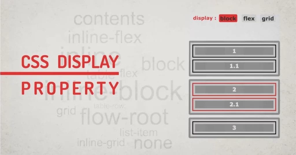
Block property:
This makes an element full width and takes as much space as available. It gives the element a minimum required height so whenever any variant of the block is used, the element will take full-width space, being a block-level element and can no longer behave like an inline-level element. This breaks the content before and after the block display.
- display: block;
- display: flex;
- display: grid;
In the example below, see how these display properties try to use the available width, that’s the block behavior. They are block, grid, and flex containers.’
Inline properties:
These are mostly used in text content where elements flow in line with other elements. This is a normal behavior of the text elements. Like span, strong, em, i, sup, sub, etc. Inline display type does not break content, instead, the content will be in the same line with other elements. Adding margin or padding to inline elements won’t push other elements away.
- display: inline;
- display: inline-flex;
- display: inline-grid;
Blocks and inline display values are two default behaviors of the elements that define the normal flow of the layout. Click through all the properties in the example below to see it in action.
Our technical experts can help fix any issue you are having with your website, regardless of its complexity.
Inline-Blocks:
The third type of property uses a combination of inline and block. They are inline-blocks, which have properties of both block elements and useful inline behavior. Inline-blocks are the most commonly used display property because they flow naturally, and we can use box properties to adjust margins, padding, etc. Inline-blocks create a Block Formatting Content (BFC). The creation of a BFC gives you more options to format the content. Another property value called flow-root, which creates a BFC on a block, rather than an inline element.
- display: inline-block – creates BFC on an inline box
- display: flow-root – creates BFC on a block box
See how these two properties create BFC and how they behave in the example below:
2. Outside Property Values:
These display values work on the outer type of the element and behave as a flow layout.
- display: block – It generates a block element box. When used in the normal flow, it generates line breaks both before and after the element.
- display: inline – It generates one or more inline element boxes. They don’t generate any line breaks anywhere. In normal flow, the next element will be on the same line if there is space.
Example of display block and inline properties:
3. Inside Property Values:
These display values work on the inner type of the element and work on the formatting of the context.
flow: it generates a normal flow layout using block and inline layouts. If its outer display type is inline or run-in, and it is used as a block or inline formatting context, it generates an inline box. Otherwise, it generates a block container box.
flow-root: It generates a block element box that creates a new BFC, defining where the formatting root lies.
table: These elements behave like HTML table elements.
flex: It behaves like a block element and formats its content according to the flexbox model.
grid: It behaves like a block element and formats its content according to the grid model.
ruby: It behaves like an inline element and formats its content according to the ruby formatting model.
Check the example below to see the working of these property values. Some of them are not compatible with all browsers just yet.
4. List Item Values:
Display list-item generates a block box for the content and a separate list-item inline box. The single value of list item behaves like a default list item. It can go along with list-style-type and list-style-position properties.
Displaying a list item will add a default bullet to the element. This applies to the entire child and sub-child hierarchy.
Our technical experts can help fix any issue you are having with your website, regardless of its complexity.
5. Internal Values:
Internal display values are the ones that have complex internal structures. Its value has meaning only within the defined layout mode, and its child and descendants can act differently for each of the property values.
table-row-group: This display type makes an element behave like <tbody> HTML elements.
table-header-group: Makes an element behave like <thead> HTML elements.
table-footer-group: Makes an element behave like <tfoot> HTML elements.
table-row: Makes an element behave like a <tr> HTML element.
table-cell: Makes an element behave like <a td> HTML element.
table-column-group: Makes an element behave like <colgroup> HTML elements.
table-column: Makes an element behave like <col> HTML elements.
table-caption: Makes an element behave like a <caption> HTML element.
ruby-base: Makes an element behave like <rb> HTML elements.
ruby-text: Makes an element behave like <rt> HTML elements.
ruby-base-container: Makes an element behave like <rbc> HTML elements generated as anonymous boxes.
ruby-text-container: Makes an element behave like <rtc> HTML elements.
In the example below, see how the display table requires its parent element to be display:table. All the child elements can have any of the properties discussed above.
As you might have noticed, these properties don’t go well with the outer type. There are some overlapping and some margin issues. But this is the general behavior of these properties. Table properties represent data and don’t follow the normal flow.
6. Box Values:
These types of values define whether an element should generate a display box or not. These values can affect accessibility problems if not used correctly.
contents: display contents don’t create any box, instead the element is replaced by a pseudo-box, which is a non-existent box. At this point in time, the display: contents is not fully supported in browsers, and removes elements from the accessibility tree, making it impossible for screen readers to read.
none: This display property value removes the element from the accessibility tree. This will be loaded in the browser, but it won’t render the element. This will remove all other properties of the element by making it invisible. display: none also causes problems for screen readers as the element simply goes away.
Note: In the example below, you can’t see me.
Global values:
Apart from the above six types of display property values, there are global values.
- display: inherit – This will inherit the display property from its parent.
- display: initial – This will use the initial value of the display property. Browser default
- display: unset – This will unset the value of the element and set it to inherit if a parent has inherited values or initial.
Check the default behavior of the display property in the example below; all the elements have some kind of default display value applied to them, even if not defined by CSS. This can be inspected by Chrome Dev Tools or Firefox Dev Tools.
Single-Valued and Two-Valued Properties:
As we discussed at the beginning of this article, the display property affects the outer and inner type of the element, Some browsers have support for explicitly specifying both the type by using two-value display syntax. In Level 3 of the display specification, we can specify both the type in the display syntax:
Selector{ display: <outer> <inner> }
- <outer>: defines values for the box. Can have inline or block values.
- <inner>: defines display values for children. Can have any of the six types of property value.
If this syntax seems complex, let’s understand it with a simple example,
We set a display value of grid to an element, like display: grid, which means all of the child elements of the current parent will be displayed as a grid item and will use the advantage of the grid model. However, the parent itself will display the value of the block. So when we specify display: grid, it converts to display: block grid as a two-value syntax.
Here are some examples explaining how to use the display property in CSS using single-value and two-value syntax.
| Single Value | Two-Value | Description |
| block | block flow | Crates outer block box with a normal flow inner |
| inline | inline flow | Crates outer inline box with normal flow inner |
| inline-block | inline flow-root | Crates outer inline box defining a BFC |
| list-item | block flow list-item | Crates outer block box with normal flow inner and additional marker box |
| flex | block flex | Crates outer block box with inner flex layout |
| inline-flex | inline flex | Crates outer inline box with inner flex layout |
| grid | block grid | Crates outer block box with inner grid layout |
| inline-grid | inline grid | Crates outer inline box with inner grid layout |
| table | block table | Crates outer block box with inner table layout |
| inline-table | inline table | Crates outer inline box with inner table layout |
CSS Display Properties and Accessibility
As discussed, some properties like display: none, display: contents remove the element from the accessibility tree. This makes the element unavailable for screen readers. Some elements, like tables, need to have a display value of the table to parse correctly in the accessibility tree. If we use display: block on table elements, it can alter their representation in the accessibility tree.
Final Thoughts About Display Property in CSS:
If you’re using CSS for quite a while, you might use legacy values most of the time because they work in all browsers. However, as browsers become capable, some of the display properties are becoming obsolete and are being replaced by more modern properties. CSS libraries like Bootstrap have already shifted from floating block-based layout systems to the grid and flex-based systems. In the future, there might be full support for other display properties and two-value syntax, but for now, we have plenty of modern display properties to make our layout more robust.