Have you ever wondered why your WordPress website isn't receiving the traffic it deserves? Are visitors leaving before exploring what you have to offer? Perhaps it's time to turn the spotlight on your website navigation. Have you considered that your navigation might be causing more confusion than clarity? In the ever-evolving digital world, user experience is important, and an improperly navigated website can be a significant obstacle to user flow. Complex menu structures and slow-loading pages create a frustrating experience, prompting users to abandon ship. Delving into these issues reveals the root causes of traffic loss.
Let's explore how addressing these issues can be the key to unlocking a more engaging, traffic-friendly online presence, and enhancing your website's appeal.
Analyzing Your Website's Navigation
Analyzing Your Website's Navigation is an essential step to ensure that the users can find what they're looking for. A smooth navigation experience leads to higher engagement rates and fewer drop-offs. It's crucial to conduct a thorough analysis of your website's navigation regularly.
Identifying Common Navigation Issues
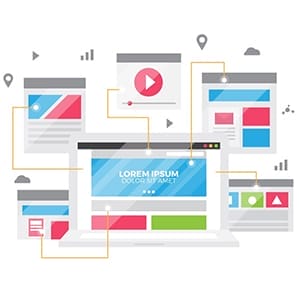 To identify common navigation issues, it’s important to understand what makes navigation effective.
Firstly, clear labeling is essential for easy navigation. Links should be labeled to communicate their purpose and where they will take the user.
Secondly, consistency throughout the website is key. Navigation menus should look and function the same way across all site pages so that users don’t need to relearn how to use them each time they visit a different page.
Thirdly, having too many options in your navigation menu can lead to confusion and make it hard for users to find what they’re looking for.
Evaluating User Behavior
Evaluating user behavior is a critical aspect of designing an effective website. However, it's not always easy to understand how users interact with your site. Various tools and techniques are available, but two of the most useful methods are heatmaps and user testing.
Heatmaps provide visual representations of where users click or scroll on your website. By analyzing this data, you can identify which parts of your site are getting the most attention and which areas aren't utilized as much. This information can help you make informed decisions about the layout and design of your site.
User testing involves having real people use your website while providing feedback on their experience. This can be done through surveys, interviews, or by observing them directly as they navigate through your site. User testing helps you better understand how users interact with your website, what frustrates them, and what they find valuable.
Simplifying Navigation with a Clear Hierarchy
A clear hierarchy can simplify navigation and help users find what they're looking for quickly.
Importance of Clear Hierarchy
 The importance of a clear hierarchy cannot be overstated as it not only makes it easy to navigate but also enhances the user's engagement with the site.
A well-defined hierarchy organizes content in a manner that ensures users quickly find what they are looking for without confusion or frustration. Users expect to see menu items arranged according to their relevance, making logical sense and easy to comprehend.
When visitors perceive that navigating your website is difficult, they will most likely leave and never return. Therefore, implementing a proper hierarchy can help increase conversions and reduce bounce rates.
Tips For Creating A Clear Hierarchy
Here are some tips for creating a clear hierarchy that will simplify navigation on your website.
- Start by identifying your primary and secondary navigation items.
- Primary items should be the most important pages on your site, such as home, about us, services, and contact us.
- Secondary items could include sub-pages or categories within these primary pages.
- Prioritize consistency across all pages on your website.
- Use the same font size, color scheme, and formatting throughout the site so that users can easily recognize which elements are clickable links or buttons.
By organizing these pages into a clear hierarchy, you will make it easier for users to navigate through your site.
Usage of Menus Effectively
Navigation is an essential part of any website, and a clear hierarchy can make it easy for users to find the information they need. Using drop-down menus and mega-menus effectively is one way to simplify navigation on your site. A well-designed menu can guide visitors through your pages and help them understand how your content is organized.
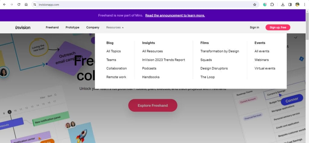
- Drop-down menus are a popular choice because they are simple and easy to use. They allow you to present a list of options without cluttering up your page with too much information. However, if not properly designed, drop-down menus can be frustrating for users who have trouble navigating through them. To avoid this issue, ensure that each menu option is clearly labeled and that the menu itself is easy to access from any page on your site.
The drop-down menu of the Invision website gives users a clear vision of the website flow.
- Mega-menus is another effective way to simplify navigation by providing visitors with more options at once.
The mega menu of the Amazon.com website represents major department categories with further subcategories.

Enhancing User Flow with Call-to-Actions (CTAs)
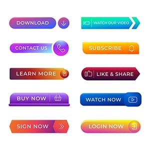 User flow is a critical aspect of website design that determines the success of your online business. It refers to the process by which users navigate through your website, from one page to another, until they achieve their goal. One way to enhance user flow and improve user experience is by using call-to-actions (CTAs). CTAs are buttons or links that encourage users to take action on your site.
CTAs provide a clear path for users to follow and guide them toward completing an action. They can be used in various forms such as "Buy Now," "Sign Up Today," "Download Now," or any other action you want users to take on your site. By placing CTAs strategically throughout your website, you can direct users toward specific pages and increase conversion rates.
Best Practices For Using CTAs
A well-crafted CTA can drive traffic to your website, generate leads, and increase conversions. However, crafting effective CTAs is not easy, as it requires a deep understanding of your target audience and their behavior.
It is important to create a sense of urgency in your CTAs by providing a clear deadline for when the offer expires. This encourages potential customers to take action immediately rather than procrastinating and potentially forgetting about the offer altogether. Additionally, using action-oriented language like “buy now” or “sign up today” helps create a sense of excitement and urgency that motivates customers to engage with your brand.
Ensure that your CTAs stand out visually on the page. Use contrasting colors and bold typography so that they catch the visitor's eye immediately.
Examples of Effective CTAs
Effective CTAs are crucial in driving conversions and achieving business objectives. Here are some examples of effective CTAs.
1. Netflix’s “Join Free for a Month” CTA is one of the most successful examples of CTA implementation.

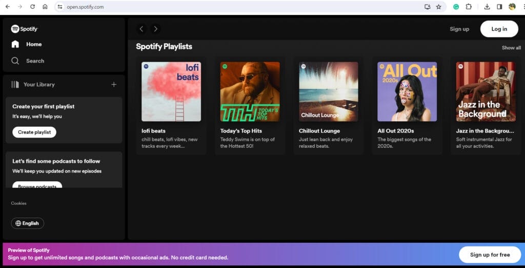
2. Spotify's "Sign up for free" CTA is another great example of companies using CTAs. The phrase ‘Free’ encourages users to sign up without the risk of being charged and any apprehension leading the user towards joining.
3. Next is a Facebook Ad from Airbnb. The CTA used is "Book Now", which is clear and actionable. Additionally, the ad includes social proof by displaying the number of people who have booked through Airbnb for similar trips. This creates trust and encourages users to take action.
4. An example of an effective CTA in an Instagram Ad can be seen in Fabletics' ad campaign. Their CTA is "Shop Now" which relates well to their audience's desire for convenient shopping experiences. The ad also includes a limited-time offer which adds urgency to the call to action.
Optimizing Navigation for Mobile Devices
 Navigating a website on a mobile device can be frustrating, especially if the site is not optimized for small screens. That's why it's important to ensure that your site's navigation is easy to use on all devices, including smartphones and tablets. By optimizing your navigation for mobile devices, you can improve the user experience and increase engagement with your site.
Mobile optimization involves making adjustments to a website's design and functionality so that it looks and performs well on smaller screens. This includes optimizing images, reducing page load times, simplifying navigation menus, and ensuring that all content is easily readable on a mobile device. By doing so, businesses can improve the overall user experience for their customers accessing their websites via mobile devices.
Tips For Optimizing Navigation For Mobile Devices
To optimize navigation for mobile devices, keep it simple, streamlined, and intuitive. This means using a clean design with easy-to-read text and buttons that are large enough to be tapped without accidentally clicking on adjacent ones. Avoid using too many drop-down menus or submenus as these can be confusing for users and tiresome to navigate on smaller screens.
Another important tip is to prioritize content based on its relevance to the user. This means organizing your navigation menu based on the most popular pages or sections of your site so that users can access them easily from their mobile devices.
Examples Of Effective Mobile Navigation
The first example is the hamburger menu icon. This icon consists of three horizontal lines stacked on top of each other and is often found in the top left or right corner of the screen. When clicked, it reveals a dropdown menu with all the essential links to different pages on your site. The hamburger menu allows for maximum screen space while still providing easy access to essential links.
Another example is tabbed navigation. This type of navigation displays tabs at the bottom or top of the screen which users can tap to switch between different sections or pages within your site.
Another good example of this can be seen in Google Maps mobile app which uses a clean design with large buttons that are easily distinguishable from one another. Additionally, the app provides simple yet descriptive labels for each button making it easy for users to navigate without getting lost.
Improving Website Navigation with Plugins and Tools
There are several plugins and tools available that can help you improve your website's navigation. These include breadcrumb navigations, mega menus, sticky headers, and search bars. Breadcrumb navigations provide users with an easy way to track their location on your website by displaying a trail of links leading back to the homepage.
Mega menus allow for more content to be included in the main menu, making it easier for visitors to find what they're looking for without having to click through multiple pages.
One such plugin is the "Sticky Menu" plugin which allows you to create fixed menus that stay visible even when the user scrolls down the page. This helps maintain easy access to important links without having to scroll back up to the top of the page every time they need to navigate somewhere else on your site.
Another tool worth considering is "UberMenu" which provides customizable drop-down menus that can be tailored to fit any website design or layout.
Final Take
Improving WordPress website navigation and user flow is an essential step in creating a successful website. Website owners should keep their navigation menus simple, organized, and easy to use. Additionally, page titles should be relevant and appropriate for the content. It's also important to consider the user's experience when designing a website as well as how users are likely to navigate through it.
Additionally, you should also consider using plugins that provide extra features for navigation and usability. Finally, make sure to regularly test your navigation system to ensure it remains effective over time. Taking these steps will ensure that your website's navigation is efficient and effective.


