Home » CSS » All CSS Shorthand Properties: CSS Border, CSS Margins, CSS Paddings, CSS Backgrounds, CSS Fonts
Are you using autocomplete suggestions in the code IDE to write your CSS? If the answer is yes, then you should rethink your scripting style. Auto-suggest will almost suggest all the different properties when you start typing. Still, there is a better way to do CSS styling with less code. That’s by using shorthand properties whenever possible.
Some of the CSS properties have a shorthand syntax. Using shorthand syntax, we can specify more than one value of the consequent properties without typing each one individually. In the CSS specification, certain properties can be grouped with their parent property.
How to use CSS Shorthand Properties?
Unlike traditional methods of property definition, we can specify multiple properties in the same group on the same line. There are some considerations when writing shorthand.
- Required and optional values and their default values
- Order of the specified values
- If the property can have multiple values
Why should I use CSS Shorthand Properties?
You should use shorthand properties to optimize your code.
For example,
In HTML, if you have hundred distinct elements that have different padding values and imagine you specify CSS rules by using 4 different padding property values you would end up writing four lines of code a hundred times = 400linesof code, instead you can do the same using a single line property hundred times = 100 lines.
To summarise the entire thing,
you have saved about 300 lines of code just by using short properties.
Here are some properties worth learning. You can also check this cool infographic, which summarizes this entire article.
Properties that have order relevance.
1. Flex:
Flex Shorthand Syntax:
{flex: <grow> <shrink> <basis>;}
- Grow and shrink: Accepts a unitless number
- Basis: excepts width values like: 100px,100em,100%, calc()
Flex Shorthand Properties:
One Value:
{flex: <grow or basis>}
This accepts either a unitless number, which will be considered as a value for flex-grow, or the value of flex-bases if it has a valid width value.
Two Values:
{flex: <grow> <shrink or basis>}
This accepts two values, the first one is a unitless number which will be considered as a value for flex-grow, the second value will be either a type unitless number or a valid width format, which will be considered as flex-shrink and flex-basis, respectively.
Three Values:
{flex: <grow> <shrink> <basis>}
This accepts two unitless numbers, flex-grow and flex-shrink, respectively, and the third value is for flex-basis, accepting width. The order of the property is important while declaring.
2. Flex-flow:
Flex-flow Shorthand syntax:
{ flex-flow: <direction> <wrap>}
flex-flow: <direction> <wrap>}
- Direction: accepts valid flex direction values – row | row-reverse | column | column-reverse
- Wrap: accepts valid wrapping values – nowrap | wrap | wrap-reverse
Flex-flow Shorthand Properties:
Single Value:
{flex-flow:<direction or wrap>}
Accepts valid value either from flex-direction or flex-wrap values.
Two values:
{ flex-flow: <direction> <wrap>}
This accepts two values, the first being a valid flex-direction value and the second, a valid value of flex-wrap.
3. Box model properties:
Some of the box model properties share a common property syntax.
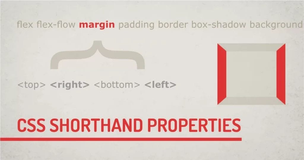
{border-width: <top> <right> <bottom> <left>;}
{padding:<top> <right> <bottom> <left>;}
{margin:<top> <right> <bottom> <left>;}
{scroll-margin:<top> <right> <bottom> <left>;}
{scroll-padding:<top> <right> <bottom> <left>;}
- All of these properties: accept valid width values like: 100px,100em,100%, calc().
All of these properties follow a clockwise traversal starting from the top. This can be easily memorized by word: Trouble.
TRBL – Top Right Bottom Left.
Shorthand CSS Properties for margin, padding, scroll-margin, scroll-padding:
Single Value:
{property: <top and right and bottom and left>}
This accepts only one valid width value, which applies to all subsequent properties of the selected properties.
Two Values:
{property: <top and bottom> <right and left>}
This accepts two valid width values. The first value applies to the top and bottom, and the second applies to the right and left properties.
Three Values:
{property: <top> <right> <bottom>}
This accepts three values. The first value applies to the top, the second to the right, and the third to the bottom.
Four Values:
{property: <top> <right> <bottom> <left>}
This accepts three values. The first value applies to the top, the second to the right, the third value to the bottom, and the fourth to the left.
Again, this works for margin shorthand and padding shorthand, where the position of the value is fixed.
4. Border-radius:
Border-radius CSS Shorthand syntax:
{border-radius:<top-left> <top-right> <bottom-right> <bottom-left>;}
Border-radius properties: accept valid width values like: 100px,100em,100%, calc()
Border-radius behaves about the same way as box-model properties. But instead of starting from the top and proceeding clockwise, the border-radius starts with the top-left corner and proceeds in a clockwise direction.
Border-radius uses the same one to four value syntax as the box model.
Border-radius Shorthand Properties:
Single Value:
{property: <top-lleft and top-right and bottom-right and bottom-left>}
This accepts only one valid width value, which applies to all subsequent properties of the selected properties.
Two Values:
{property: <top-left and bottom-right> <top-right and bottom-left>}
This accepts two valid width values. The first value applies to the top-left and bottom-right, and the second value applies to the top-right and bottom-left corners.
Three Values:
{property: <top-left> <top-right> <bottom-left>}
This accepts three values. The first value applies to the top-left, the second to the top-right as well as the bottom-left, and the third value to the bottom-right.
Four Values:
{property: <top-left> <top-right> <bottom-right> <bottom-left>}
This accepts four values. The first value applies to the top-left, the second to the top-right, the third to the bottom-right, and the fourth to the bottom-left.
5. Box-Shadow:
Box-shodow Shorthand Syntax:
{box-shadow: (<x> <y>) <blur> <spread> <color> <inset>}
- X and Y: accept valid width values to specify shadow direction.
- Blur: accepts blur radius value.
- Spread: accepts positive or negative spread values for shadow.
- Color: accepts valid color values.
- Inset: sets shadow direction inside the box.
Box-shadow Shorthand Properties:
Three Values:
{box-shadow: (<x> <y>) <blur or color or inset>}
This syntax uses a group value of <x> and <y> together. They can’t be separated and accept valid width values. The second value can be of either type: blur value or color value, or inset. box-shadow can determine the property type by checking the specified value type.
Four Values:
{box-shadow: (<x> <y>) <blur or color or inset> <spread or color or inset>}
Four-value syntax is capable of detecting values for blur and spread. The important thing to note here is that we can change the order of color and inset. We can use shadow-color and inset irrespective of order. But width values have to be in order.
For example,
If we want to specify <blur> and <spread> in this syntax, we have to use it with properties <x> and <y>. Here is an example of the wrong and correct way.
Wrong:
{box-shadow: 4px red 4px; }
{box-shadow: 4px inset 4px; }
{box-shadow: 4px 4px 10px red 10px; }
{box-shadow: 4px 4px 10px inset 10px; }
Right:
{box-shadow: 4px 4px red; }
{box-shadow: 4px 4px red inset; }
{box-shadow: 4px 4px 4px inset red; }
{box-shadow: 4px 4px 10px -5px inset red ; }
Our technical experts can help fix any issue you are having with your website, regardless of its complexity.
Five and Six Values:
{box-shadow: (<x> <y> <blur> <spread>) <color> <inset>;}
Five and six value syntax uses the same rule as for value syntax. The point to remember here is not to break a sequence of <x> <y> <blur> and <spread>. Property values of inset and color can be specified irrespective of ordering.
Properties that have no order relevance.
1. Border:
Border Shorthand Syntax:
{border: <color> <style> <width>}
- color: accepts valid color value like : red,#fff,#ffff, rgb(),rgba()
- border-style: accepts valid border styles: none | hidden | dotted | dashed | solid | double | groove | ridge | inset | outset
- width: accepts a valid width value.
CSS Border Shorthand Properties:
Single Value:
{border:<style or width or color>}
This accepts only one value, which is considered a value for border-style or width, or color, depending on the value specified. Border property can identify if the value is a border-color or border-width, or any of the style values.
Two Values:
{border:<style or width or color> <style or width or color> }
This accepts two values, as a value for border-style or border-width, or border-color, depending on the value specified.
Three Values:
{border:<style or width or color> <style or width or color> <style or width or color>;}
This accepts three values, as a value for border-style or border-width, or border-color, depending on the value specified.
Noticed how the values of the border property have no significance on the order? One can use any of the consequent properties for the border.
2. Background:
Background Shorthand Syntax:
{background: < background-color > < background-image > (< background-position >/< background-size >) < background-repeat > < background-attachemnt >}
Background: accepts color or image properties.
- Color: It is a single valid color value. Background-image has another group of properties that can be specified as irrelevant or ordering.
- Image: accepts a URL of any valid image.
- Position: accepts valid value with or without coordinates like 100px,50%, center, etc.
- Size: declares the size of the background image; the acceptable values are: %, contain, cover, etc.
CSS background Shorthand Properties:
Single Value:
{bacground: <color or image>}
Accepts one value of either type, color, or URL of the image
Multivalue Syntax:
{background: <color> <image properties>;}
The background is capable of detecting multiple property values specified in any order. Just a point to note here is that background-size is dependent on <background-position>, so it has to be grouped with < background-position> can always be used with <x> <y>/<background-size>.
3. List-style
List-style Shorthand Syntax:
{list-style:<image> <position> <type>;}
- image: accepts image url for bullet.
- position: accepts named values of inside and outside.
- type: accepts bullet type values – Disc | Circle | Square | Decimal | georgian | String | counter
CSS list-style Shorthand Properties:
Single Value:
{list-style: <image or position or type>;}
This accepts the single value of any consequent property. We can specify either position, list-image, or list-type of their property.
Two Values:
{list-style: <image or position or type> <image or position or type>;}
This accepts the two values of any consequent property. We can specify either position, list-image, or list-type of their property. List style is capable of handling the order of the property.
Three Values:
{list-style: <image or position or type> <image or position or type> <image or position or type>;}
This behaves the same as the two-value property.
4. Font:
font Shorthand Syntax:
{font: <style> <variant> <stretch> (<size>/<line-height>) <weight> <family>;}
- style: accepts styling values – normal | italic | oblique
- variant: accepts values of the small-caps variant
- stretch: accepts named values – semi-condensed, ultra-condensed,semi-expanded, ultra-expanded, % values are also accepted but not applicable for shorthand.
- size: accept valid number with unit px, pt,vw,%, em, rem
- line-height: accepts a valid number with unit px, pt, vw, %, em, rem, etc.
- weight: accepts boldness values – bold, normal, light, lighter, 100, 200, 300
- family: Accepts any of the valid font names.
CSS font Shorthand Properties:
Two values:
{font: <size> <family>;}
Accepts mandatory values of font-size and family. Font Family is always the last value in the syntax.
Three Values:
{font: <size> <weight or line-height> <family>;}
This syntax accepts values for font-weight or line-height in-between size and family. The order of the properties matters for this syntax.
Four values:
{font: <style or variant or stretch> <size>/<line-height> <weight> <family>;}
This syntax can accept required values as well as optional values, with font family being the last property. The font property has required properties that need to be specified in a particular order. Optional properties (style or variant, or stretch) can be specified before the required property in any order.
Five to seven values:
{font: <style> <variant> <stretch> (<size>/<line-height> <weight> <family>);}
This is the full syntax of the font property. Like a value property, this property can have an optional property in any order, followed by required properties in the required order.
5. Animation:
Animation Shorthand Syntax:
{animation: <name> <duration> <timing-function> <delay> <iteration-count> <direction> <fill-mode> <play-state>;}
Read more about the CSS animation property in this article.
CSS Animation Shorthand Properties:
Two-value syntax:
{animation: <name> <duration>}
Accepts values for animation-name specified in the @keyframes definition and duration to trigger the animation.
Three Values Syntax:
{animation: <name> <duration> <timing-function or delay or iteration-count or direction or fill-mode or play-state>}
This accepts other optional values for the animation. All the properties in animation are named values. So, its ordering is not important. For example, if we specify timing two times, the first value is considered as duration and the second one is a delay. A number without any unit is always going to be an iteration count.
6. Transition:
Transition Shorthand Syntax:
{transition: <property> <duration> <timing-function> <delay>;}
All the transition properties are listed in the article.
CSS transition Shorthand Properties:
Two values Syntax:
{transition: <property> <duration>}
Two values are required to trigger the transition. A property and a duration. Other values are optional.
Three or Four values Syntax:
{transition: <property> <duration> <timing-function> <delay>;}
Optional values are named values that can be specified in any order. Based on the sequence, the transition will identify values for duration and delay.
Our technical experts can help fix any issue you are having with your website, regardless of its complexity.
Which Properties Can Optimize CSS Code?
Almost all the properties mentioned in this article can help improve the CSS code, keeping it DRY. That includes the border, box-shadow, font, border-radius, and flex. But box model properties are widely used as shorthand properties.
Final Words Using The Shorthand
CSS is used to make your project modular and maintainable. Shorthand properties can help to optimize CSS code by removing additional lines of code. Use CSS shorthand syntax wherever possible. Most developers use CSS shorthand for box-model properties, but there are a ton of other properties that can help to improve your coding style.