Home » CSS » When To Use CSS Blending Modes – All Blend Mode Explained
Image editing has been easier than ever since so many apps support blending two images. Mixing two images is cool, but once the image is saved, you can no longer modify it. This means that once you get your website assets designed by a designer, you’re left with an image you can’t modify. CSS can help to display your web assets with blend modes.
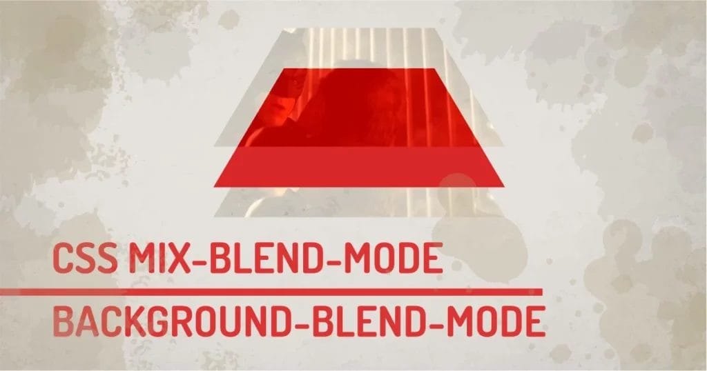
CSS Blend modes open up various design possibilities within the browser, so you’re not limited to what the image alone represents. Blending or Mixing is combining two elements or two backgrounds to compose a final image. How the final outcome will display depends on the modes used. CSS currently has two properties that enable the blend mode.
- mix-blend-mode: This property enables blending two DOM elements.
- background-blend-mode: This property will only blend background properties.
CSS offers 15 different blend modes apart from the default. I have grouped them into 5 groups depending on their functionality. Let’s understand all of them with working examples.
Let’s consider an example with two layers. The first layer is a base layer, and on top of that, we’ll add a blending layer. The result will be a blended version of both images.
What are the Different Blend Modes in CSS?
CSS Blend Mode Syntax:
Selector{
blend-mode: <value>;
/* or */
mix-blend-mode:<value>;
}
- <value> : normal | multiply | screen | overlay | darken | lighten | color-dodge | color-burn | hard-light | soft-light | difference | exclusion | hue | saturation | color | luminosity
Let’s go through all the groups in detail. I have created demos with images and various overlays. Click on the circles to try and compare them in real-time.
Darken (Multiply) :
This CSS blend mode mostly multiplies the pixels of the layers. This group contains three values as follows:
- Darken: It blends pixels based on luminance values in each color; the result is either the base color or blend color, depending on which is darker
- Multiply: It blends the luminosity of the base color with the blend color. The result is always a darker color.
- Color Burn: It gives darker colors than the darken mode because it increases the contrast between the base and blending layer.
When you multiply a big number by another number, it gets bigger, In terms of colors, the dark color becomes darker. This group makes an image darker.
Hover over the Normal Button in the below demo and observe the black and grey color shades. Now switch the modes by hovering over other buttons. Noticed the dark area becomes darker? This type of CSS blend works great with shades of grey. All 3 values – darken, multiply, and color burn use a different algorithm to blend pixels. But they all tend to make images darker as a common behavior.
When is it useful?
When you have lots of dark colors in the image and you want only a blending layer to affect that dark area, you can use it.
- A card with a caption with a background image with a color overlay
- Make an image darker
- Blend the dark color with the image
- Remove the white background from logos
Our technical experts can help fix any issue you are having with your website, regardless of its complexity.
Lighten:
This CSS blend mode basically divides the values. So small value becomes smaller, making it much lighter. This group contains three values.
- Lighten: It mixes the Lighter color between the base and the blending layer.
- Screen: It blends lighter colors of both layers, but this one has a greater blending range than lighten, depending on the luminosity of the image.
- Color Doge: It works as a lightener, but it decreases the contrast between the base and blending layers, making it much brighter.
All the blend mode CSS in this group enhances the white color. So, lighter colors of the blending layers are blended with the base layer.
Observe the White color and the grey spectrum in the example. Now, hover over the different effects to see them in action. You’ll notice the white colors affecting the layer beneath. This is the default behavior of the values in this group. They all make white brighter.
When It’s useful?
When you want to make an image bright so that black text is visible on the image, you can use this CSS blend mode. This way, you can get a washed version of the image.
- A card with a dark caption with a background image with a color overlay
- Make the Image Lighter
- Change the color of the image
Contrast (Complex):
Probably the most used blend mode in CSS. This group has three values, and it performs blending based on the contrast of the blending layer.
- Overlay: It blends pixels using mid-tones. Its blending is done at half strength, so both lighter and darker colors shift towards the middle of the color range.
- Soft Light: a version of the overlay that blends layers depending on the luminance value of the base layer.
- Hard Light: A version of overlay that blends layers depending on the brightness of the base layer.
This group blends colors softly, so it’s used without opacity. Other blending modes are harsh and feel overdone. CSS Blend mode in this group may work just fine out of the box.
Observe all the colors and shades of grey. Switch the blending mode by hovering over the other buttons. You’ll notice these modes blend colors perfectly as you expect them to do. Unlike Darken and Lighten modes, this group works well with colors overlay being the default, and soft light and hard light adding variation to the color blending.
When It’s useful?
You can use overlay mode any time when you want to overlay an image or color, or gradient softly on the base layer.
- To add a color theme or color overlay to images
- Add a color overlay
- Softly change the colors of the base layer
Inversion (Comparative) :
This mode inverts the pixel on the base layer. This simply means the colors will jump to the opposite colors. Red will become Cyan, Green will become Magenta, and blue will become Yellow. There are two possible values in the group:
- Difference: Produces a result by finding the difference between pixels of the blending layer and the base layer.
- Exclusion: Blends white color values by inverting the colors of the base layer.
Modes in this group invert colors depending on their brightness values. So, Black color is mostly unaffected, and White will 100% invert the colors.
Observe the Black Color, White Color, and other colors in the example. Hover the mouse to change the CSS blend mode. Spoiler: They look horrific. These CSS blend modes are rarely used on the web.
When It’s useful?
This can be used to create a negative effect. Although it’s not used often on the web, one can create unique effects using these CSS blend modes.
- When used with opacity, it can create a custom effect
- To Invert the Image
- Change monochromatic icon colors on Hover
Composite (HSL):
This group has three values, and each blends pixels differently based on the Hue, Saturation, and Luminosity. These modes blend layers as per their names:
- Hue: It preserves the luminosity and saturation of the base layer and blends colors by their lightness or darkness value.
- Saturation: It preserves the luminosity and hue of the base layer and blends colors based on the color strength value.
- Color: preserves the luminosity of the base layer. It will just overlay the color on top of the base layer, removing the base layer’s colors.
- Luminosity: Luminosity keeps the hue and saturation of the base layers but blends the luminosity of the blending layer.
This group works on the HSL model, so Blacks, Whites, and Greys have no greater effect on the blending.
Observe the colors in the example below, and switch the mode to see the difference between each of them.
When It’s useful?
Since these blend modes blend layers with different values, these blend modes have too specific jobs.
- To create a greyscale or sepia image
- To desaturate the image with a 50% grey color
- Create custom monocolored effects
Other Values:
The other CSS blend mode is the default one that doesn’t do anything. But it’s worth mentioning – normal, inherit, initial, revert, and unset. This mode exists but does nothing, so I have not included it in any of the groups.
Watch out!
Since CSS blend mode is rendered by browsers, you’d not see the same results across browsers. If you’re a perfectionist, you’d hate the little dissimilarities of blending results across different browsers.
Our technical experts can help fix any issue you are having with your website, regardless of its complexity.
Browser support for background-blend-mode and mix-blend-mode
Most browser supports all 15 blend modes using CSS. But to make sure, check caniuse before you try it on real projects. Some browsers don’t support all the blending modes, and you might know this already, that some browsers won’t support this feature ever. So if you’re not an IE fan, you’re free to use it.
CSS Blending Modes and Performance
These blending calculations are computed within the browser, It affects performance a little bit. We can update blending modes in real-time so which could slow down the rendering process sometimes.
Are CSS Blend Modes Worth Using?
There is too much going on under the blending modes in the browser. But having the ability to change images on the fly opens up a gateway to unlimited possibilities. Because you can blend more than one layer and create a new effect. When you work on a new project, you’d just import a normal image from Photoshop instead of a merged image, because the browser can do blending for you. It’s much easier to replace the image and try CSS blend modes within the browser to select the one that works.
Credits:
tenor: https://tenor.com/
unsplash: https://unsplash.com/