Home » CSS » What Are Types of CSS: How To Add Inline, Internal and External CSS
Using CSS in your HTML designs is essential, and there are many ways to add CSS to your HTML. Let’s explore ways to add CSS to your code.
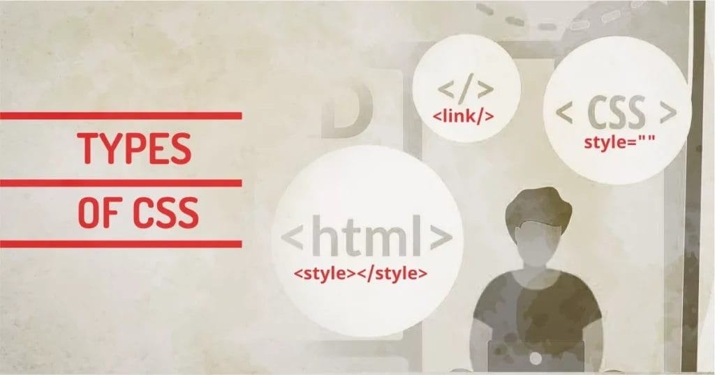
There are three types of CSS
1. Inline
2. Internal (Embedded)
3. External.
These methods are used in the industry since limited browsers were popular and Internet Explorer was the only browser. Since then the process is pretty much the same.
A good thing would be having an understanding of all these techniques and then using one over the other. Before learning ways to add CSS to HTML, let’s quickly understand the types of CSS.
CSS syntax and declarations will always stay the same no matter what method we use to add them to HTML. We can classify the Types of CSS in three ways.
- Inline CSS: This type of CSS is added directly to the HTML element using the style attribute.
- Internal CSS: This type of CSS is added to the head tag of the individual HTML page.
- External CSS: This type of CSS is added as an external resource. All CSS declaration is stored in an external .css file and it’s linked to the HTML page.
Now it’s time to compare all the CSS types and understand the pros and cons of each.
1 – Inline CSS
In the early ages of web development, HTML didn’t support many ways of styling. At that time, HTML presented styling attributes.
<p><font size="2"></font>Hello World</p>
But that was deprecated as the browser became capable. We can use style as an attribute of the HTML tag. This method still works today. This type of CSS will apply CSS rules directly to the tags.
<p style="font-size:1rem;">Hello World.</p>
- Has Highest specificity or precedence in a documents
- Quick To Process
- No Need to define Selector
- Works with Email Clients
- It can Overrider CSS you don't want to
- Less effective in bigger projects
- No pseudo elements
How to use Inline CSS:
Inline CSS can be added to any self-closing or non-self-closing HTML tag by adding a style attribute inside the tag. Inside the style attribute, any valid CSS properties and their value can be specified. Multiple attributes can be added using a semicolon separator. This syntax doesn’t use any selectors so there are no curly brackets in the syntax. Another bummer: pseudo-elements can’t be used using this method. If you don’t know about pseudo-elements, you can check the most useful pseudo-elements ::before and ::after in the article.
Problem with Inline CSS:
<tag style="property:value;...">
Now you know how to add multiple CSS properties using the inline CSS method. But wait. One property can have multiple sub-properties.
For Example, the font has many sub-properties like font-size, font-weight, font-family, etc. If inline CSS is not used correctly, it easily becomes overhead for your HTML. One needs to think of optimizing inline CSS by using the short-hand CSS method, otherwise, you’d end up creating more code than content. See how Simple Hello World would look with individual properties:
<p style="font-family:Arial; font-size:12px; font-weight:500; font-style: italic;">Hello World</p>
Code to Content Ratio 🙁 47 characters of code/11 characters of content.
If you have multiple styles defined using this method, you’d create chaos while maintaining it. Inline CSS is not reusable and not scalable. It mostly works as a temporary solution and in dynamic applications where these styles are dynamically added with JavaScript, You’ll have a hard time maintaining it.
When to use Inline CSS:
Mainly I have to use this in my email templates or mailer code. As email clients filter out some of the code that they find dangerous to their systems. Some clients remove JavaScripts, Some Clients remove External CSS and Fonts, some block images in the first load.
Designing Email Templates or Newsletter Templates could be frustrating for beginners because it just doesn’t look right in all clients. Some of the CSS properties will simply be removed client. And we have to be very selective about elements and our inline CSS.
Our technical experts can help fix any issue you are having with your website, regardless of its complexity.
So while developing the Email Templates, I combine modern and Traditional CSS to maximize compatibility. I use both inline and internal CSS to style. For the web page, Browsers are capable of rendering almost everything, but this is not the case with email clients.
2 – Internal / Embedded CSS
There are many ways to embed CSS. The standard way is to add in the <head> section to the HTML file. We’d simply add a <style> tag and start defining rules using selectors. The CSS code block would look something like this
<!DOCTYPE html>
<html lang="en">
<head>
<style>
body{margin:0; padding:0; position: relative;}
img{max-width:100%;}
p{ font-size:14px;}
...
</style>
</head>
<body>
...
</body>
</html>
When using the internal type of CSS, we can use the <style> tag anywhere in the HTML file, but to add it in the head is a good practice. Internal CSS has less priority than inline CSS.
- Can define selectors
- Can be loaded Quickly
- Higher precedence than external style
- Has to be defined on all the pages
- May increase load time
How to use Internal CSS:
As mentioned above, we need to specify a <style> tag on the document. Best practices suggest adding it in the head. But it can be added anywhere on the document, and it will still work. The syntax for declaration is simple. We use CSS selectors, and all the properties are assigned within that rule only. The Selector is specified using curly brackets.
selector{ css rules }
The commonly used selector list is down below:
| Specificity / weight | CSS Selector | Description |
|---|---|---|
| 1 | Inherited styles | Browser Selected |
| 2 | * | Selects all elements |
| 3 | element | selects tags |
| 4 | attribute | selects element based on attribute value |
| 5 | class | selects class=”…” attribute |
| 5 | ID | selects id=”…” attribute |
| 7 | Combined selectors | can be a combination of any of above |
Using any of these selectors, we can use one result for all similar kinds of designs. For Example, we can style each H1 element with the same style. All paragraphs can have the same style, so we don’t have to style them individually.
<style>
/* Global Selector */
*{ color:#000; font-family:arial; }
/* Tag Selector */
h1{ font-size:24px; }
/* Attribute Selector */
input[type="text"]{ border:1px solid black; }
/* class Selector */
p.style1{ text-transform:uppercase; }
/* id Selector */
p#style2{ color:red; }
/* combined Selector */
#style2.style3{ color:green; }
</style>
Problem with Internal CSS:
Best practices say to use CSS code in the head section. Adding thousands of lines on the page itself will block the page above the fold making it slow to load. And imagine doing this for all the other pages on the site will make the entire site slow. Feels like it creates one problem while solving one. We can make reusable code with this method, but still, it’s not scalable across all the pages on the site. This method still doesn’t solve the problem of scalability.
More on top of this, If we keep adding style to different parts of HTML, it will become difficult to maintain, and it may even stop making sense of which style is applied from which part of CSS. May developers have a habit of adding !important if they don’t find a solution, which ends up being messy.
When to use Internal CSS:
When we are developing a smaller/single-page site, there is no point in creating separate files for styling. It can be done in one single <style> block. If you’re just developing a prototype, you can put a simple block and get things done, but this is not a good practice if we’re creating a site for clients.
If we use Internal CSS for Bigger Projects, we’d end up making HTML files big in size, affecting the page load time. This CSS works only on the page on which the block exists, so we have to repetitively add CSS on all the pages.
More advanced developers use minified inline CSS in the head to fix the FOUC (Flash Of Unstyled Content) problem. This simple technique allows critical CSS (the rules that are needed to render above-the-fold content) to be loaded in the head. So we can have styles above-the-fold content loaded before the content itself.
3 – External CSS
I’d say the most efficient way to use CSS in HTML is using external CSS. If you have a plan for your HTML page, you can define all the elements, tags, and selectors in one single file and link them on all pages. So you don’t have to worry about adding the same style block to other pages.
This global CSS will be reusable throughout your website project. Designers and Coders love to use CSS this way. This makes coding practice much efficient.
The concept of using libraries or frameworks uses this fundamental. We just need to link one CSS file and we can use its pre-defined classes and modifiers in all files of the project.
Linking to the external CSS world looks something like this.
<!DOCTYPE html>
<html lang="en">
<head>
<link rel="stylesheet" href="style.css" media="screen" />
</head>
<body>
...
</body>
</html>
We’ll use <link> the tag to link external CSS.
We have to specify what type of link it is, with attribute rel="stylesheet" media attribute can be ignored as it defaults to screen. We could change it if we have definitions for printing purposes.
Another way to link is using the @import method.
code looks like this:
<!DOCTYPE html>
<html lang="en">
<head>
<style>
@import url("style.css");
</style>
</head>
<body>
...
</body>
</html>
We’ll simply import the external file using the @import url method. @import can work inside external CSS. The only point to note is that @Import works only at the beginning of external CSS.
- Rapid development
- Faster load time
- Organized code
- CLS: Layout shifts while loading external CSS
- Multiple external CSS can slow the download time of page
How to use External CSS:
External CSS can be linked using the link tag or by the @import tag within the <style> tag inside the head. Both the syntax looks like this:
<link rel="stylesheet" href="file" media="screen" />
or
@import: url(file) media
Both of these methods can have the following parameters:
- file: Specify an external file name to be loaded
- media: Can be any supported media for the stylesheet
Many media types can be used for the selection of a particular style or device. More Info
Benefits of using External CSS:
For bigger projects, it makes sense to use external CSS because it solves the main problems of maintainability, reusability, and scalability:
- External CSS can be loaded once and cached in the browser cache. This will make subsequent page loads much faster because they are using global code.
- If all pages use different modules, we can modularise CSS with its own module-specific file and load module CSS when needed. This will optimize the number of requests per page load.
- Maintaining several CSS files is easier than maintaining a mixture of HTML, CSS, JavaScript, and other content. Just update one rule, and the whole site will get that update
Our technical experts can help fix any issue you are having with your website, regardless of its complexity.
When to use External CSS:
When you’re in a production environment, you should always use the best practices that the industry is using. This way you can have more control over your code. When working on big projects, you must keep all your files organized. So you can keep CSS in one folder and JS in another folder to keep it organized.
Best Practices: Using CSS
- Always use External CSS when possible.
- If you’re using Libraries like Bootstrap or UIKit, you can link those files directly from CDN providers. This will reduce load time.
- Link CSS by their behavior. like screen.css, responsive.css, print.css.
- Avoid using inline where possible, properties can be modified using efficient selectors in external CSS.
- In some cases, it’s okay to let go of browser suffix/vendor prefix. Modern browsers render style with standard rules.
I use the methods below depending on what type of job I am doing.
| Job | Inline | Internal | External |
|---|---|---|---|
| Yes | Yes | May Be | |
| Webpage / Prototype | No | Yes | No |
| UI Design | May Be | No | Yes |
| Website | No | No | Yes |
Final Words
So you know the types of CSS and how to add CSS to HTML. This is nearly the tip of an iceberg, because, in real life, the HTML is often manipulated by JavaScript and CSS can be dynamically generated wherever needed. If you are a designer, your responsibility is to make things as clean as possible. Because if you’re part of a team, you might be the first person in the pipeline, and how good you do it will affect the workflow of your entire team. In real life, you’d use a combination of all of these methods to get the best out of all three. After all, each method does have its pros and cons, so why not use all of them to their advantage?