Home » CSS » How To Do Box Shadow In CSS Correctly | CSS Box Shadow Generator
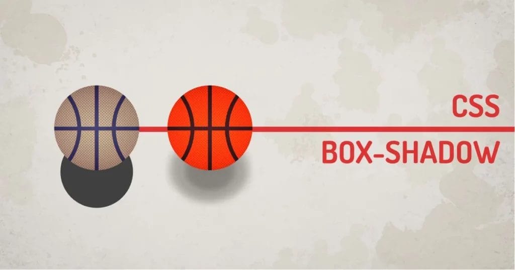
If you have been a UI designer for a while now, you must know that the trending drop shadow effects are all around the internet. Even in flat UI, the designers use a small amount of drop shadow to make elements more realistic. Shadow or drop shadow gives elements a sense of depth, and realistic shadows are hard to create because there is no major difference between a shadow and a realistic shadow. Let’s discuss how to use CSS box-shadow in detail.
To create a CSS box shadow, we can use a CSS property called box-shadow. It applies a shadow to the entire bounding box. It has little flexibility to change its shape and size using CSS. The other version of the shadow is a filter. The filter version of shadow can be applied to almost anything visible.
CSS Box Shadow Syntax:
Selector{box-shadow: x y blur spread color inset;}
- X: Defines the horizontal offset of the shadow. It accepts any numeric value.
- Y: Defines the vertical offset of the shadow. It accepts any numeric value.
- Blur: Defines the blur amount of the shadow. The default value is zero. Blur applies to both axes.
- Spread: Defines the size of the shadow. It accepts any numeric value. Position increases its size, and a negative value decreases its size. This can not be less than the size of the element itself.
- Color: Defines the color of the shadow. It accepts a valid color value or name.
- Inset: The inset will change the direction of the shadow. The keyword inset will make shadow emmit from the inside of the box. The default is blank, which will create a shadow outside of the box.
JavaScript Syntax:
document.getElemenById('element').style.boxShadow = '1px 1px 10px';
The value of box-shadow can be defined using the same string as CSS. To create multiple shadows, these string values can be combined using a comma (,)
The syntax is good enough to give you a nice set of shadows. The real problem here is that it’s easy to create a shadow, but too difficult to get it right. What I mean is, we can’t just play with the shadow parameters and call it a day. Tons of UI designers do it right, and others don’t.
Let’s try to create a simple shadow. Before we do that, let’s see why we need a shadow. Observe the following example. It’s a circle sliding along the space. Look a bit flat, right?
Now with the same demo, let’s add a simple shadow.
We’ll use the code below to add a shadow to the ball element.
.ball{box-shadow:1px 4px 5px 0 rgba(0, 0, 0, 0.8);}
Just by adding the shadow, we can see the difference.
The element feels like it’s lying on the floor. It looks a little bit better.
Observe the ball + shadow in the above example.
Let’s try to give it a perspective on the element using shadows now.
Theory Time:
In real life, when something blocks the light, it causes a shadow. The shadow size depends on the distance of the blocking object from the light and the distance of the blocking object from the casting plane. This terminology is used in 3D rendering, but let’s fake it using shadow properties.
We’ll use the same example and animate the shadow using CSS animations. It’s a simple keyframe animation that changes the position and other factors of the shadow to give you a sense of depth.
Observe the following example:
Viola. It’s the same sliding ball. But this time, because of the shadows, the ball seems like it’s bouncing off the floor. This example uses a single shadow element. From in 3D engine’s perspective, let’s call it a single-pass shadow.
But,
There is a logical explanation of how shadows work in real life and are calculated by a render engine. We’re not going to go into depth about the rendering. But realistic shadow depends on the direction of light and the material itself.
The light emitted from the light source bounces off the surface. It creates a shadow. The color of the shadow depends on the surface from which it is cast and the behavior of the material. The render engine uses a bounce light, which makes the shadow look real. Multiple passes of the light make the object look real because realistic light bounces.
Enough of theory.
How do we do realistic box shadows using CSS?
Let’s try to use multipass shadow using the RGBA color space.
CSS Shadows using RGBA colorspace:
We will use two passes to add more details to the shadow based on what we discussed about the real-life shadows. By doing this, we’ll end up with this example:
Observe the above example. It is used to set off shadows like this:
@keyframes ball {
10%,30%,50%,70%,90%{
box-shadow: 0px 0px 0 0 rgba(0, 0, 0, 0.4), 1px 4px 0 0 rgba(0, 0, 0, 0.4);
}
0%,20%,40%,60%,80%,100%{
box-shadow: 1px 150px 10px -10px rgba(0, 0, 0, 0.2), 1px 150px 40px 10px rgba(0, 0, 0, 0.2);
}
}
If you observe it, we’re just manipulating the opacity of the shadow. Sometimes it is hard to get the color of the shadow right when using the RGBA colorspace because opacity changes the color of the overall shadow. Instead, let’s change the rgba color space to hsla. This way, we can control saturation and value using the same color. We’ll be able to control colors more accurately.
Our technical experts can help fix any issue you are having with your website, regardless of its complexity.
CSS Shadows using HSLA colorspace:
Here is the same example with two shadow passes with HSLA color space.
Observe the color of the shadow. If you compare this with real life, the shadow is not black, it’s a bit of brown color, which could be caused by bounce lights from the environment as well as the wooden surface below. It looks a bit more real.
Multipass CSS Shadows using HSLA colorspace:
Now let’s give it the final touches by giving it physically accurate shadows, by giving it multipass shows. Let’s say we will use 5 passes to more accurately render the shadow.
Observe the example below:
This example gives you a physically more accurate shadow. We can’t go crazy with the multiple shadows because it costs memory. We used 5 shadows, costing 5x more calculations.
The code for the above examples uses 5 different shadows.
@keyframes ball {
10%,30%,50%,70%,90%{
box-shadow:
0px 0.8px 0.1px hsla(24, 100%, 22%, 0.05),
0px 1.8px 0.2px hsla(24, 100%, 22%, 0.2),
0px 2.9px 0.4px hsla(24, 100%, 22%, 0.4),
0px 4px 0.7px hsla(24, 100%, 22%, 0.6),
0px -2px 5px 2px hsla(24, 100%, 22%, 0.8);}
0%,20%,40%,60%,80%,100%{
box-shadow:
0px 70px 4px hsla(24, 100%, 22%, 0.083),
0px 90px 24px hsla(24, 100%, 22%, 0.161),
0px 110px 48px hsla(24, 100%, 22%, 0.239),
0px 130px 96px hsla(24, 100%, 22%, 0.317),
0px 150px 128px hsla(25, 18%, 37%, 0.4);}
}
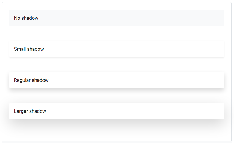
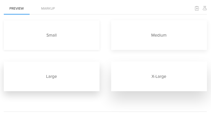
Let’s compare shadows from various CSS frameworks.
Bootstrap Shadow:
.shadow-lg { box-shadow: 0 1rem 3rem rgba(0,0,0,.175)!important; }
UIkit shadow:
.uk-box-shadow-xlarge{box-shadow: 0 28px 50px rgb(0 0 0 / 16%);}
TailwindCSS Shadow:
.shadow-2xl{ box-shadow: { --tw-shadow: 0 25px 50px -12px rgba(0,0,0,0.25); }
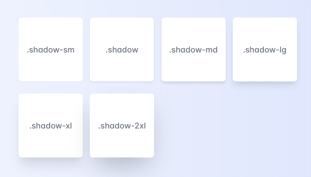
Takeaways from these CSS frameworks are that they all use a single shadow to stay optimized. There is a huge drawback to using shadows on elements rather than boxes. Because box-shadow hugs the edge of the DOM element itself. Which is not so efficient for irregular shapes, like transparent images.
CSS Box Shadow And Transparency:
Observe the shadow, which will make you hit your head on the wall. Did you just read an entire article about the drop shadow, only to find out it’s of no use? Not really. The developers of CSS are smart enough to give us just what can make UI look good. Drop Shadows on Images isn’t the technique that most designers like to use. It’s not a bigger problem to solve.
CSS Shadow using Filter:
The quick fix for the problem is to use the drop-shadow filter. It does not have the spread radius parameter. But it does the job with PNG / SVG / borders.
Solution using filters:
The above example uses the following code for adding a shadow to images:
.tree, .bird{
filter: drop-shadow(1px 4px 5px rgba(0, 0, 0, 0.4));
}
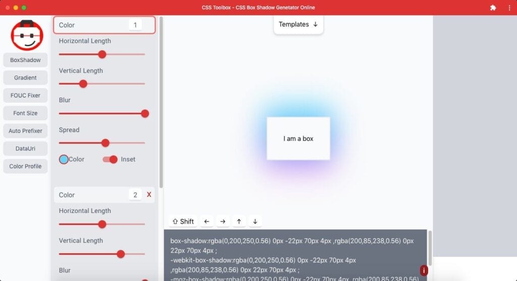
You can experiment with the CSS box shadow generator tool to make your own shadow.
Side-by-side comparison of what we learned today:
How To Create Realistic Shadows Using CSS?
Box-shadow is a great CSS property to use to create realistic shadows. Here are some tips on how to create realistic shadows using the box-shadow property:
- Use a slightly darker color for the shadow than the background color. This will give the shadow some depth and make it look more realistic.
- Make the shadow slightly larger than the object it’s casting a shadow on. This will also help give the shadow some depth and make it look more realistic.
- Use multiple box shadows to create a more complex shadow. To create a more gradient effect, you can use different colors for each shadow or offset the shadows so that they’re not all perfectly aligned.
- Finally, don’t forget about adding a bit of blur to your shadows!
If you like to play weird, you can try my CSS box-shadow designer tool. It has many Templates to play with.
What Not To Do While Creating Box-Shadow?
- Do not use shadows with zero offset, like: box-shadow: 0px 0px 10px. This creates a uniform shadow from all sides. Shadows are used to make things elevate.
- Do not use black shadows. Black goes with all the background colors, so people get away with using transparent black shadows instead of using Dark color-matched shadows.
- Do not overdo it. Sometimes we need a touch of shadows with a little border. Making it too obvious will kill the depth, making it unrealistic.
Our technical experts can help fix any issue you are having with your website, regardless of its complexity.
Final Words:
If you’re to use shadows in the future, try this out. Make shadows bigger, transparent, colored, and multilayered. There is a thin line between shadows and realistic shadows. Most people won’t notice the difference between them, but sometimes viewers’ eyes can catch the realistic-looking element more than what’s just there for the sake of being a shadow element. You can use my online CSS shadow generator tool to experiment with your skills. You can use various box shadows to enhance your UI and give it depth.