Big Brands That Are Using WordPress

WordPress has turned out to be the most popular blogging platform and website builder. It is also the most popular content management system software. It has powered over 35% of websites in the entire world. Even many big brands choose to run several of their websites on this platform.

Here are some examples of popular brands using WordPress.

TechCrunch
 

TechCrunch

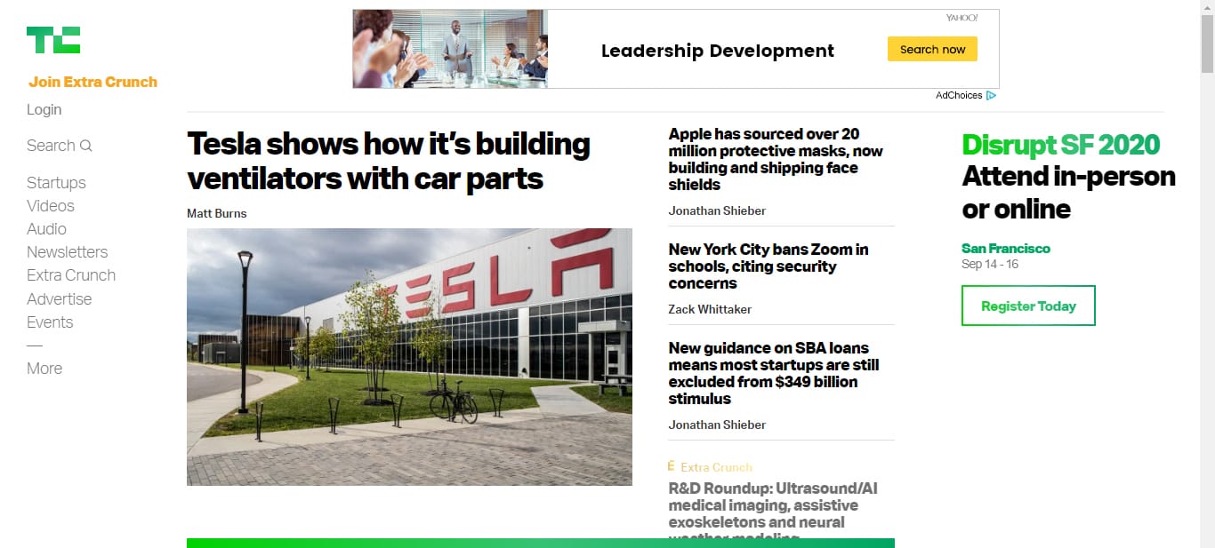
TechCrunch is one of the top resources for tech and media.

The New Yorker

The New Yorker

The New Yorker has beautiful and easily readable typography.

BBC America
BBC America

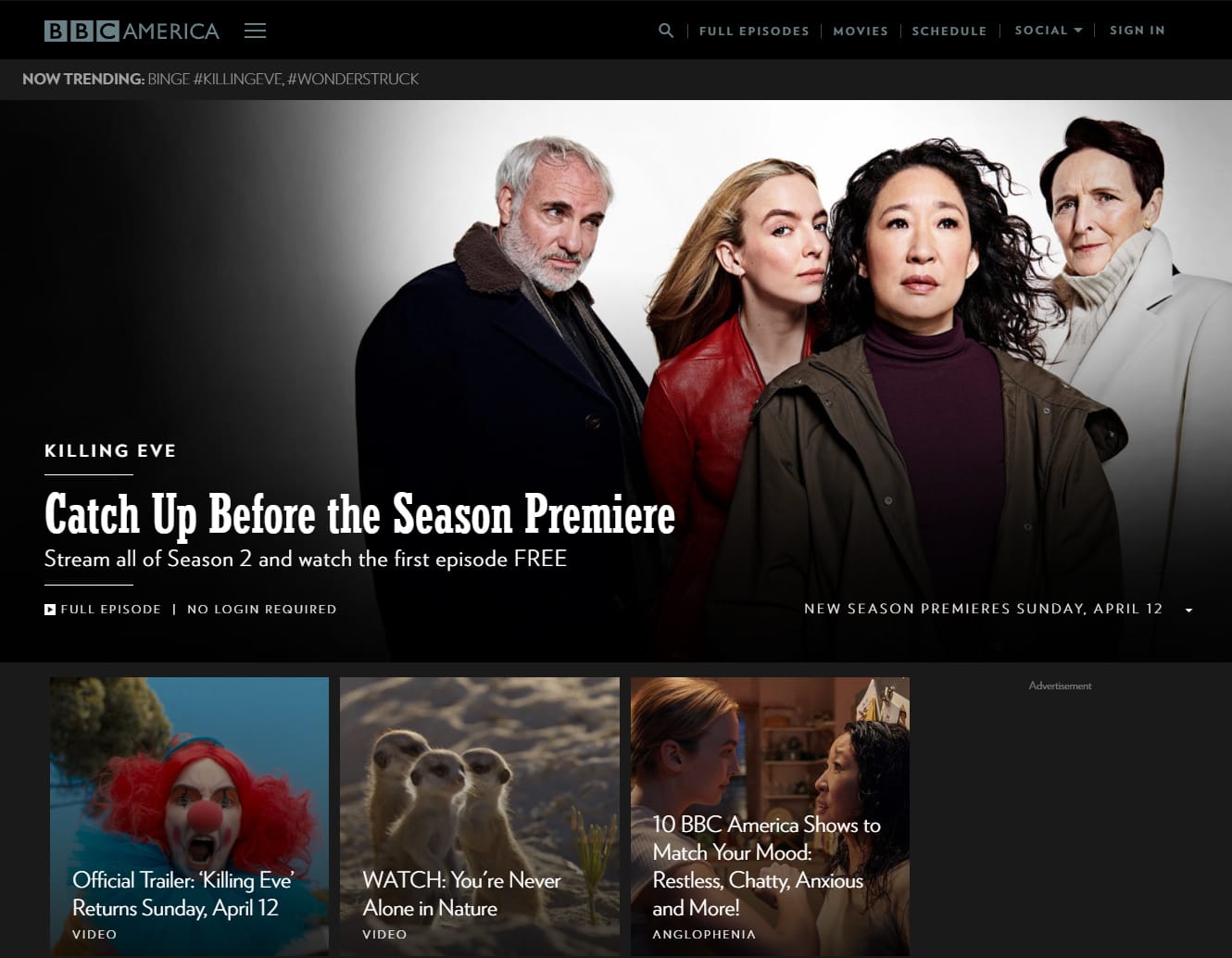
BBC America’s website has a modern design and large featured images.

Bloomberg Professional
Bloomberg Professional

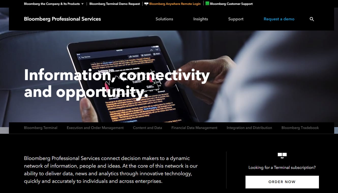
Bloomberg Professional website has a full-width video header. The content is arranged in intuitive blocks.

Variety
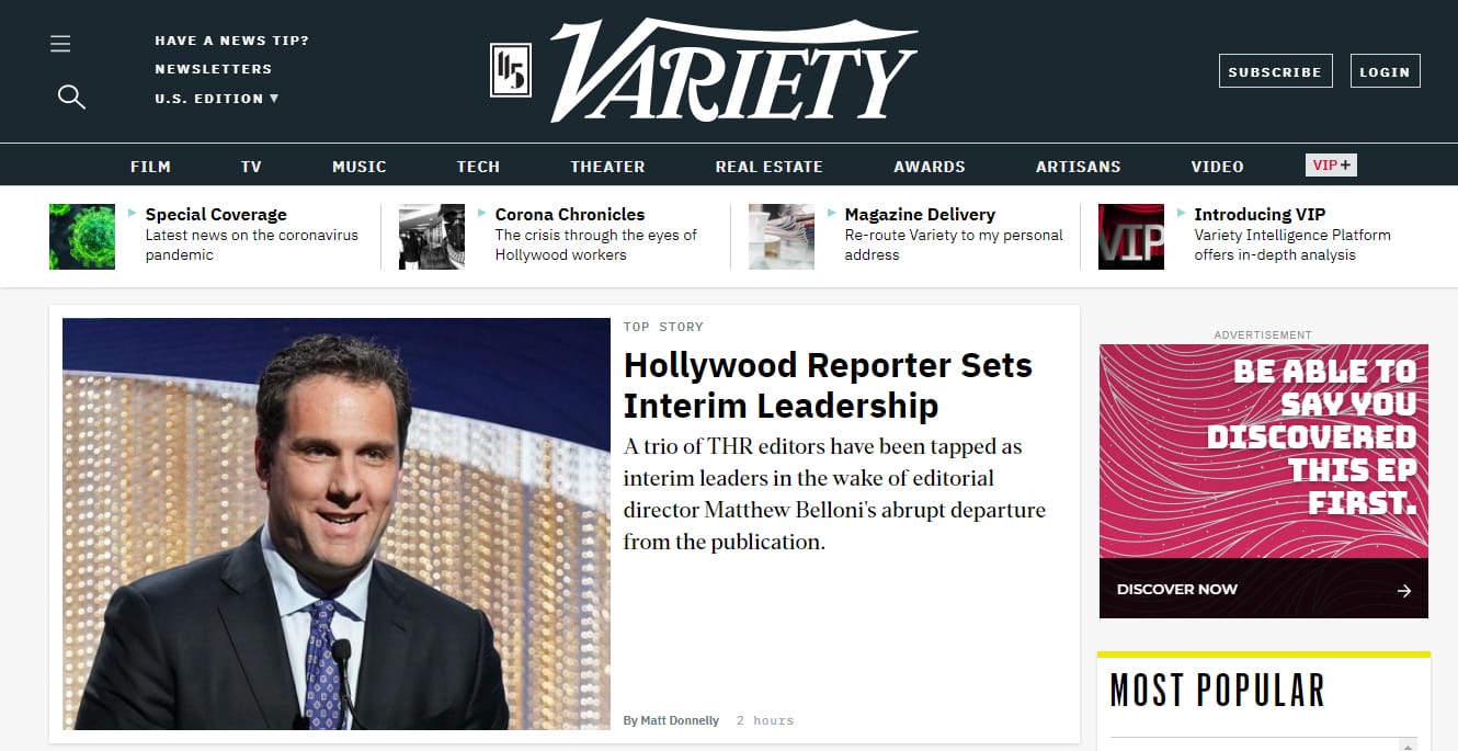
Variety

Variety has a clean and modern magazine design.

Sony Music
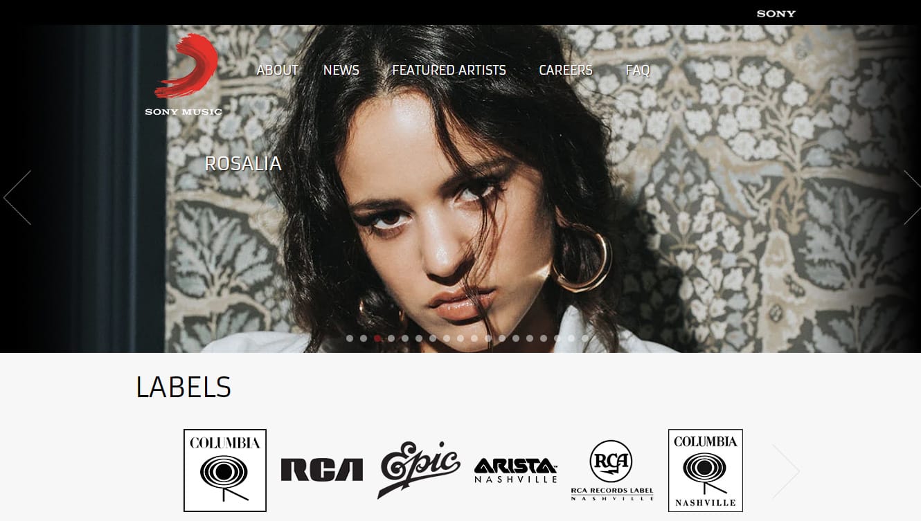
Sony Music

Sony Music’s website has a clean homepage.

MTV News
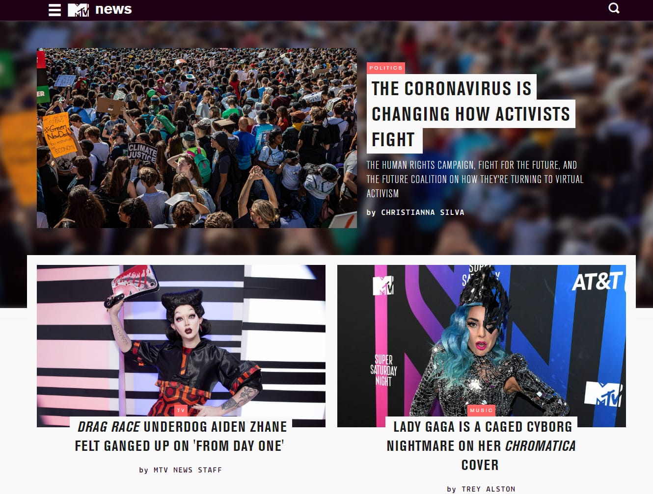
MTV News

MTV News website has many media elements and visuals.

PlayStation.Blog
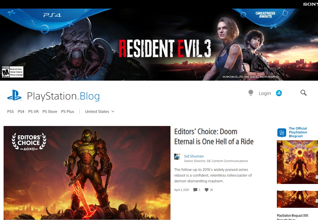
PlayStation.Blog

PlayStation.Blog has a boxed layout, dark-skinned design, and clean post pages.

Microsoft

Microsoft

Microsoft’s website has a clean design and large featured images.

Bata
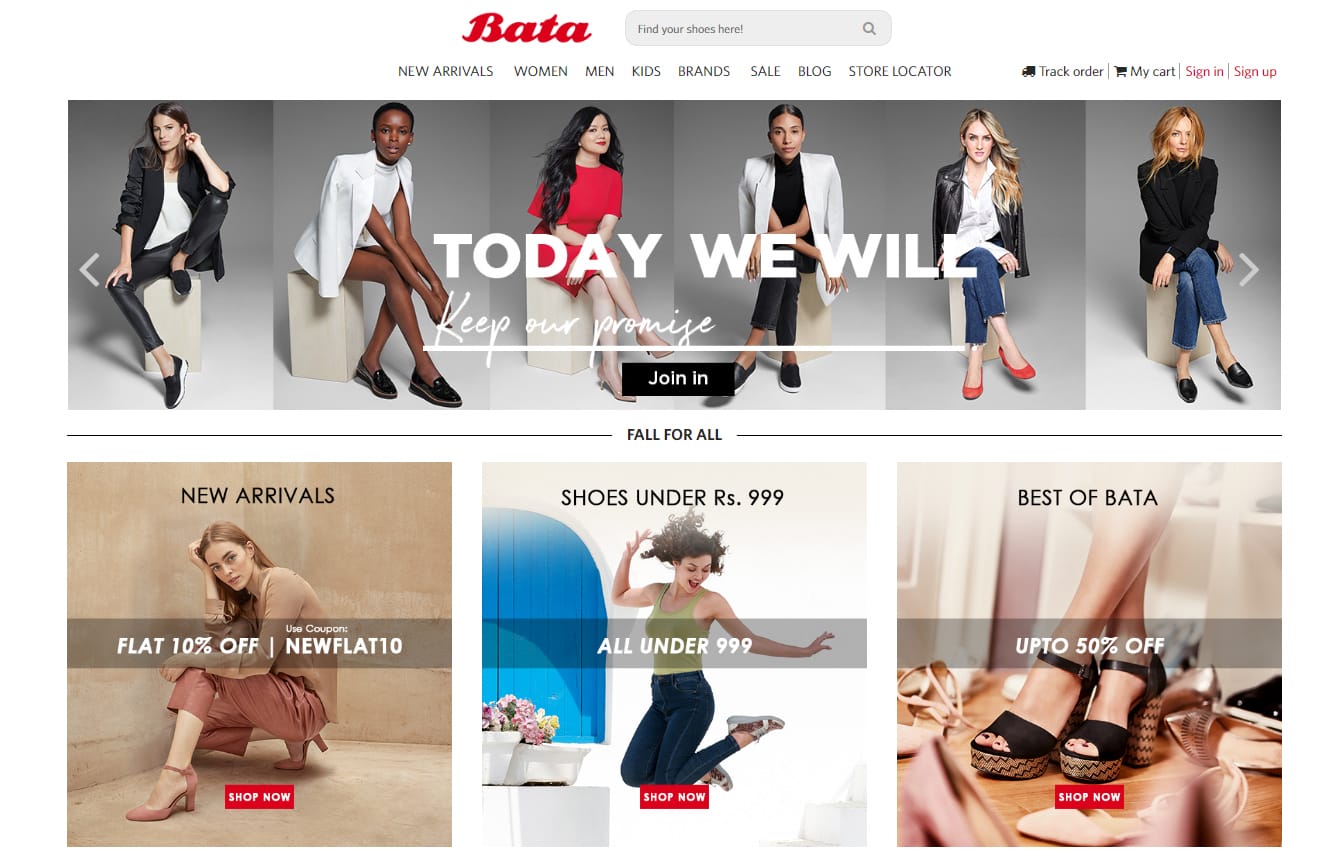
Bata

Bata’s website has a full-screen header and lots of photos on product pages that open in lightboxes.

Conclusion

Here I have figured out a few top brands that use WordPress. Now that you know that these big brands use WordPress, maybe you get inclined to WordPress for your upcoming projects. You will definitely enjoy your WordPress experience.

Continue Reading

rhodium

Rhodium Developers

Framework: WordPress – Elementor
Requirement: New custom-made website with SEO optimization
shangri_la
development

Problem

It’s a start-up company and it did not have enough stuff to showcase its work. It faced the challenge of establishing a strong online presence to attract potential clients. They wanted a visually appealing website that would convey their professionalism and expertise.

Our Plan

Execution

1A premium website template was designed in Figma. Blueprints of the home page and other internal pages were created. The color palette has been chosen wisely to exude elegance without compromising usability – sleek beige typography against crisp black backgrounds creates an impactful visual contrast that enhances readability and attention. 

2By using strong visuals such as high-quality images and graphics showcasing their past projects, we aimed to convey their expertise and build trust with potential clients. The overall tone we maintained throughout the design process was professional yet approachable, reflecting the client’s brand image as a reliable and innovative construction company.

3 By incorporating intuitive navigation features and user-friendly interfaces, we ensured seamless browsing experiences for potential clients. By focusing on creating internal pages that offered valuable content and intuitive navigation, we were able to provide users with an immersive and informative experience. With intuitive menu options, easy-to-use contact forms, and visually appealing project showcases, visitors are certain to find exactly what they need with minimal effort.

4 One of the primary goals for this project was to showcase the exceptional quality of their work through an impressive gallery section. By leveraging the power of visually appealing images and intuitive navigation, we successfully transformed their website into a virtual gallery that entices visitors to explore more.

5 A major challenge encountered during the project was effectively showcasing Rodium’s unique approach to building construction. By incorporating captivating visuals and interactive elements, such as 2D models and virtual tours, the website successfully demonstrates the intricate processes involved in constructing high-quality buildings. Additionally, clear and concise descriptions were implemented to explain each step of the construction journey, making it easily understandable for potential clients who may not be familiar with technical jargon.

Final Testing

During the testing phase, every aspect of the website will be put under a microscope to ensure its seamless functionality and performance. From checking cross-browser compatibility to ensuring smooth navigation on different devices and screen sizes, no stone will be left unturned. The comprehensive testing process aims not only to identify any potential glitches or bugs but also to guarantee that the user experience is intuitive and flawless.

By utilizing the latest techniques in search engine optimization algorithms, this website is now primed to attract organic traffic and boost its online presence.