Home » CSS » CSS Transitions Explained. Examples of Transition Properties
State changing or movement can be distracting sometimes. In CSS, some properties look ugly when changed too much. This can be changed simply by using CSS transitions so that the change in colors or position looks subtle and conveys a meaning of the movement.
CSS transitions can work as a dotted outline so you can visualize what is going to happen between two dots. It adds intermediate states automatically so the change between the starting property value and the end property value is smooth.
Transition syntax:
Transitions can be enabled by using the transition property. Most of the CSS properties are capable of doing transitions. The shorthand syntax looks like this:
transition: [property] [duration] [timing-function] [delay];
Default values of the transition property are: all 0s ease 0;
Let’s cover all aspects of the transition property in more detail.
property:
It specifies the property that needs transition. It is always a good idea to specify the property name that will transition because all properties will be transitioned otherwise. Possible values for property:
- none: No property will be transitioned
- all: All Properties will be transitioned (Default)
- property: Specified property will be transitioned.
- initial, inherit: This will initialize or inherit the behavior of the parent property.
More info on how CSS inheritance works in this article. Properties that are capable of doing transitions are as follows:
- background-color
- background-position
- border-color
- border-width
- border-spacing
- bottom
- clip
- color
- crop
- font-size
- font-weight
- height
- left
- letter-spacing
- line-height
- margin
- max-height
- max-width
- min-height
- min-width
- opacity
- outline-color
- outline-offset
- outline-width
- padding
- right
- text-indent
- text-shadow
- top
- vertical-align
- visibility
- width
- word-spacing
- z-index
Duration:
This defines a time in (ms) milliseconds or (s) seconds. The property transitions will occur for a given amount of time. Here is a demo with 5 different durations. The default duration is zero. Hover over the chessboard.
Timing function:
It defines how properties will be changed during a defined time duration. This can be specified by a timing graph. There are predefined speed progression values as follows:
- ease: Slow start, then fast, end slowly. This is the default case of animation. This style is more pleasing to the eye as this progression looks natural to any animation style. It’s demonstrated with a green line in the demo.
- linear: Same speed during the entire progression. Use full while showing mechanical animation like rotation. It’s demonstrated with a red line in the demo.
- ease-in: Slow Start and gradual progression. This one is considered a slow start. It holds animation for some time in the beginning and then progresses with ease. It’s demonstrated with a blue line in the demo.
- ease-out: Gradual progression and slow end. This one is considered a slow end. It progresses with ease and holds animation for some time before ending. It’s demonstrated with an orange line in the demo.
- ease-in-out: Slow start and end. This is a combination of both ease-in and ease-out. This will hold animation in the beginning and in the ending. Inbwtewwn it will speed up to catch up to the endpoint. It’s demonstrated with a purple line in the demo.
To understand these 5 types of timing functions, refer to the example below. Hover over the Chessboard to start the trace and see how each element progresses during the given timeline.
- steps( positive number, start|end): Can do multiple step animation of the same type. A first argument is a position number that defines iterations to be performed. The second argument accepts the value below:
- start: will trigger transition immediately when it’s called by any interaction. In the demo, you can see the dark pawns begin transitioning at the beginning of the pink timer block.
- end: will rigger transition after the first iteration. It’s like a delayed start for a defined amount of time. In the Demo, it’s shown by a light-colored pawn. It starts transitioning after the timer block is passed by.
- jump-start: will trigger the animation when the transition begins. It’s mostly identical to “start”;
- jump-end: will trigger the animation after the previous step finishes transitioning. It works mostly like an “end”.
Step-start: Equivalent to steps(#, start)
Step-end: Equivalent to steps(#, end)
Here is a small demo to understand start, jump-start, and end,jump-end. Hover on the demo to see the graph trace of the progression. You’d mostly see 2 traces instead of 4. You hardly notice any difference between the 4 of them. Because start and jump-start behave exactly the same. The same goes for the end and the jump end. The demo shows 4 overlapping lines.
- Jump-none: There is no jump on either end. Instead, holding at both the 0% mark and the 100% mark, each for 1/n of the duration. It will add a delay at the start, but it will catch up with the endpoint. Greenline in demo denotes jump-none #2 pawn shows its progression in comparison to #1. See how we have a gap between lines at the beginning? It’s about a one-step delta on starting.
- Jump-both: Includes pauses at both the 0% and 100% marks, effectively adding almost a step during the transition time. This will give us about a step at the start and one step at the end. Look at #3 in the demo, #1 is using steps (start). Comparing it with #3, we can see #3 is delayed on start and in the end by one step. In the chart, it is denoted by the red line. See it has about 1 1-step gap in the beginning and end.
Hover over the Chessboard to see how CSS transition steps work.
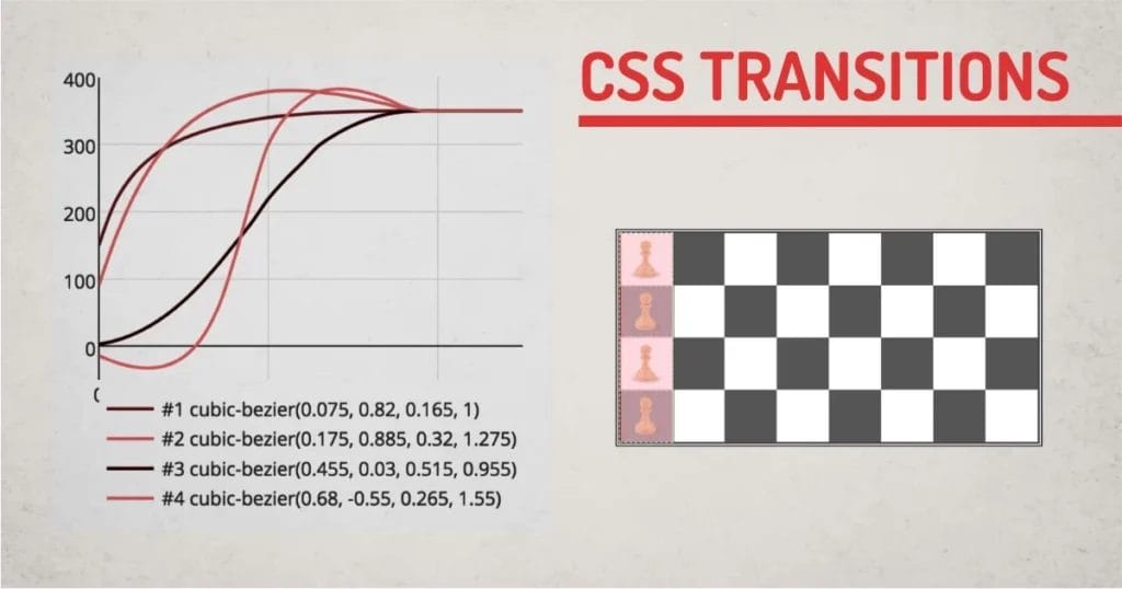
- cubic-bezier(n,n,n,n) :Define your own values in the cubic-bezier function. Possible values are numeric values from 0 to 1
Here is n example to show a couple of timing functions modified using a cubic bezier curve. There is a website that demonstrates the cubic-bezier functionality. Any complex timing functions can be created with a cubic-bezier.
There is not much explanation on this timing function, You can try it out in the Chrome inspector panel and play with it to fine-tune your timing function.
Ways to use CSS transitions
Using the Sort hand Method:
Apply CSS Transitions on Individual property:
To enable transition on individual property, we can use the syntax below:
Selector{ transition: <property> <duration> <timing-function> <delay> }
In the above syntax, we can remove the property, timing function, and delay. We need to specify a duration to make it work. If we don’t use the timing function, we can still use delay. CSS will know the first number is the duration and the second is the delay without having to specify all the parameters.
<style>
Div.box{width:100px;height:100px;line-height:100px;
div.transition{
transition:500ms;
}
div.transition{
transition:500ms 500ms;
}
div.transition{
transition: opacity:500ms linear 500ms;
}
div.transition{
transition: opacity:500ms 500ms;
}
div.transition:hover{
opacity:0.3;
}
</style>
Apply Transition on Multiple properties:
To use multiple property transitions, we can use the same shorthand properties together with (,) comma as a separator. We can use as many properties as we want with different timing parameters. The Syntax will look like this:
Selector{ transition: <property> <duration> <timing-function> <delay>, <property> <duration> <timing-function> <delay>, <property> <duration> <timing-function> <delay>;
Using Longhand Method (Consequent Properties):
Apply CSS Transitions on Individual Property:
If we want to specify transitions using the longhand method, we need to use at least 2 property values individually. Transition property and the transition duration. It works with transition-duration alone, but I won’t suggest doing that. The syntax will look like this:
Selector{
transition-property: <property>;
transition-duration:<duration>;
transition-timing-function:<timing-function>;
transition-delay:<delay>;
}
Apply CSS Transitions to Multiple Properties:
Like the shorthand method, we need to specify values for each transition property to enable transition on multiple properties. The syntax will have multiple values for all mandatory property names. Non-required values will get the default value if not specified.
Selector{
transition-property: <property>,<property>,<property>;
transition-duration:<duration>,<duration>,<duration>;
transition-timing-function:<timing-function>,<timing-function>,<timing-function>;
transition-delay:<delay>,<delay>,<delay>,<delay>;
}
How to Optimize CSS Transitions:
CSS transitions can be enabled just by specifying a value for transition-duration. By doing this, all the CSS properties will have transitions. This won’t have any effect on new smartphones or computers, but old mobiles and computer browsers can suffer from low fps transitions.
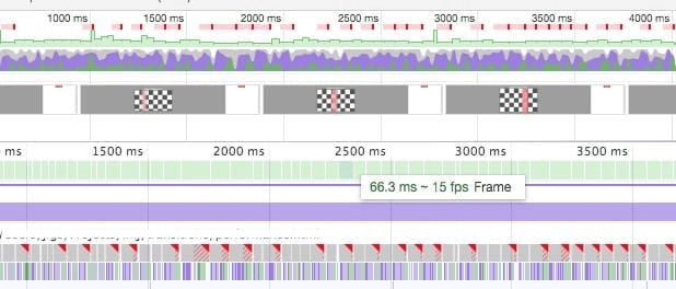
Here is a Chrome performance report of the chess transition on all properties vs transform.
This test was done using a 6x CPU slowdown to measure the performance.
Performance: 60fps average
Property: transform
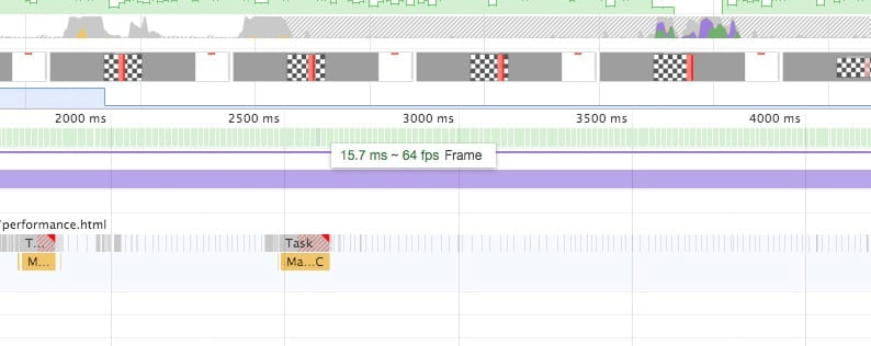
Performance: 16fps average
Property: all (opacity, background, border ,padding ,transform)
To overcome this problem, use transition-property whenever possible. You can alternatively use the will-change property so the browser can know in advance that the property will be changed during interaction and do pre-preparation for the task.
will-change: transform; /* Browser will load optimizations for transform before transition happens */
One should use will-change only as a plan B.
Plan A always stays optimized before. So, don’t have to change after.
When to Use CSS Transitions
CSS transitions are mainly helpful to display state changes on the element. So, Transitions can be used to show small interactive elements like buttons, anchor text, checkboxes, radio buttons, etc.
These elements can store a state inside them, so we can take advantage of pseudo-classes to get the state and change the element’s style. Some HTML elements can use pseudo-class like:
:hover, :active, :focus, :playing, :checked, :disabled and use transition on the element.
What is the Best Way to use CSS Transitions?
CSS Transitions are memory-heavy. So, overusing it on all the elements can slow down the interaction of your entire site. However, professional designers and CSS frameworks like Bootstrap make use of pseudo-elements to do the micro-interactions. Pseudo-elements can perform better when using transitions. I have an article explaining performance differences on using DOM elements and ::before ::after pseudo elements.
The demo below is more than meets the eye. It uses all the combinations of transitions to form a multilayer composite transition.
How to do a continuous loop using CSS Transitions?
CSS transitions are used for small event-driven animations. Loops are difficult to manage because there are no intermediate steps. To make it continuous, we can use CSS Animations.
- Quick to Implement
- Can make the interaction more appealing
- Limited to Start and Endpoint Can't add intermediate transitions.
- Memory Intensive
Final Words
Always use CSS Transitions to show small interactions. Try to use shorthand methods whenever possible and stay optimized when using transition-property. CSS transitions are a great way to add an additional dimension to your web page element, One should take advantage of CSS Transitions to improve the user experience of the site.
Check out my article on CSS Transitions vs Animations to learn more about the limitations of transitions and ways to animations.