We have awesome javascript libraries to do scroll animations. But what if we want it in pure CSS? It’s hard to say at this moment because CSS can’t really react to any event, and scrolling is an event. So is there any workaround? Or is that even a possibility?
It’s not possible to animate on scroll without JavaScript. But the experimental feature of Chrome shows that there is the possibility that in the future, we’ll be able to map scrolling events to an animation property. It’s still an experimental build and not supported in any browsers but chrome. So let’s explore how we can trigger animation on scroll without JavaScript.
Introducing scroll-timeline. Which is an experimental feature. Just like CSS animations, It has a definition and a calling property. The scroll timeline can be defined by the @scroll-timeline keyword.
We need to specify a couple of properties to define the scope of the scrolling timeline.
@scroll-timeline mytimeline {
source: selector(#somediv);
start: 0;
end: 100%;
time-range: 1s;}
- source: parent element of the scrolling timeline
- start: defines the starting point of the timeline
- end: defines the endpoint of the timeline
- time-range: defines a range for the animation. This does not relate to time.
How to sync animations with a scroll?
We can call the animation on a scroll by defining the animation0timeline property. The selector must have any predefined animation on the same property to activate it. We can call scroll time as follows:
#somediv{
animation: someanimation 1s linear 0s 1;
animation-timeline: mytimeline;
}
For more info on how CSS animation works, I have an article explaining everything about CSS Animations.
Can I trigger CSS animation on scroll without JavaScript?
As said before, this is an experimental feature. To enable this feature, you must use Chrome.
Here is how you can enable experimental features:
Step 1: Open url chrome://flags/

Step 2: Search enable-experimental-web-platform-features

Step 3: Enable the feature
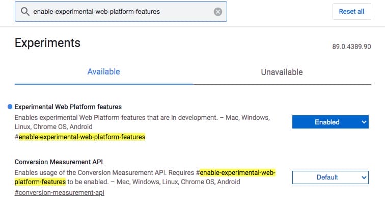
Step 4: Relaunch Chrome
Congratulations! You have enabled the lab to test your scroll animations.
Our technical experts can help fix any issue you are having with your website, regardless of its complexity.
Let’s begin with one simple example:
Roughly, here is how the experiment is built:
1. Here is a structure we have used :
<main>
<section>...</section>
<section>...</section>
<section>...</section>
<section>...</section>
</main>
The structure is the same structure used in the post explaining how to do scroll animation with javascript. We just want to define a container element and scrolling sections.
2. Define the scrolling parent
@scroll-timeline scroll {source: selector(main);start:0;end:100%;time-range: 3s;}
We need to specify the element to define the scroll timeline. This could be body by default, we can use any scrollable div element to define its scroll-timeline.
- Define 5 animation keyframes for sections
@keyframes man {
...
}
@keyframes bulb {
...
}
...
We need a keyframe animation to define the start point and endpoint of the animation. More info on CSS animations is described in the article. We can define as many keyframe animations as we want. but before we start using a timeline, we need to master CSS animation to be precise, master duration, delay, direction, and fill-mode.
4. Define keyframe-timeline while defining animation.
#man{animation: man 700ms both; animation-timeline:scroll;}
#bulb{ animation: bulb 1.5s forwards alternate; animation-timeline:scroll;}
#brain{ animation: brain 1.6s 0.8s both alternate; animation-timeline:scroll;}
#lens{ animation: lens 1.6s 1.2s both alternate; animation-timeline:scroll;}
#bug{ animation: bug 1.6s 1.8s both alternate; animation-timeline:scroll;
We can control this animation using the timeline. Consider the scrollbar as your timeline. When you scrub the scrollbar, you’re scrubbing through the animation timeline from 1% to 100%. This gives you amazing control over your animation.

Here is a CSS code for your experiment. Scroll the window to see animations in action.
Error: @scroll-timeline at-rule and animation-timeline property are not supported. Follow the steps to enable these properties in Chrome.
Our technical experts can help fix any issue you are having with your website, regardless of its complexity.
The above example is made purely using CSS. No JavaScript is used.
If you’re using a mobile, here is a pin with a GIF to see a recorder version:
So, is it the future of CSS?
It’s too early to tell. As it’s the early stage of development, and on their browsers confirms support for scroll-time. We’ll have to wait for the browser to start supporting this feature. We have a library called ScrollMagik, which does the same thing but using javascript. So for the time being, we have to use that.
Final Words:
Although scroll-timeline is a cool new feature, due to its lack of support, I wouldn’t suggest using it except for experiments. But if this feature becomes available in future versions of browsers, it’s surely going to change how we do CSS animations. I’ll keep an eye on the feature and update the post once the feature is tested and ready on most browsers.
What Next?
This article may be outdated. You can get more up-to-date info on Scroll-driven animations.